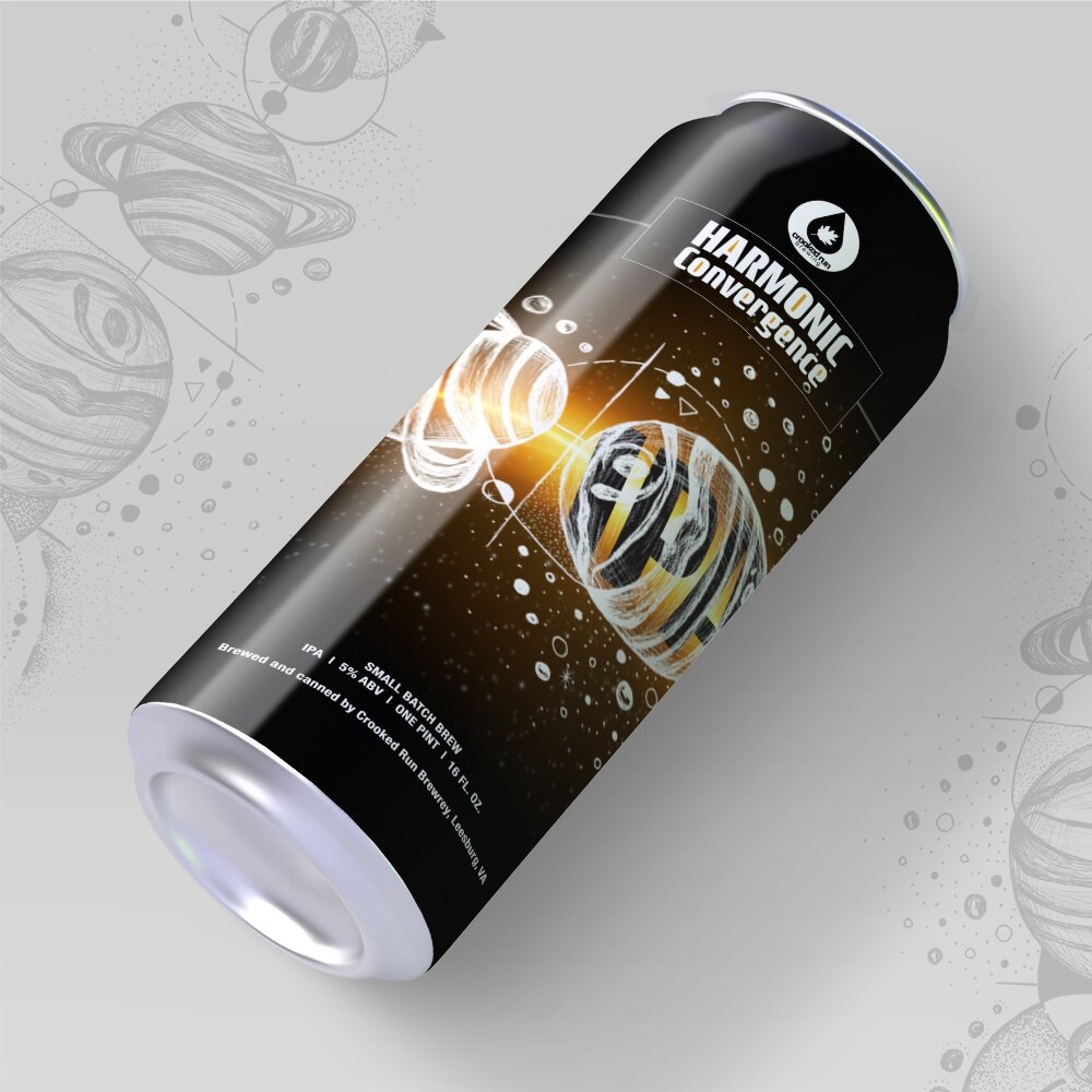
Beer Label Design - Harmonic Convergence
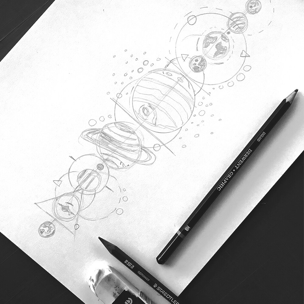
Designed for Crooked Run Brew located in downtown Leesburg, VA for their upcoming IPA. The design begins with an idea, sparked from the name of the brew. After the pencil sketch is tweaked, the ink work begins including tiny stippling dots to add to the galaxy and solar system vibe. My beer can design brings out the brews brand personality with this dark background and a bright harmonic beam of light.
Gander below how I push the creative limits in a galaxy far far away!
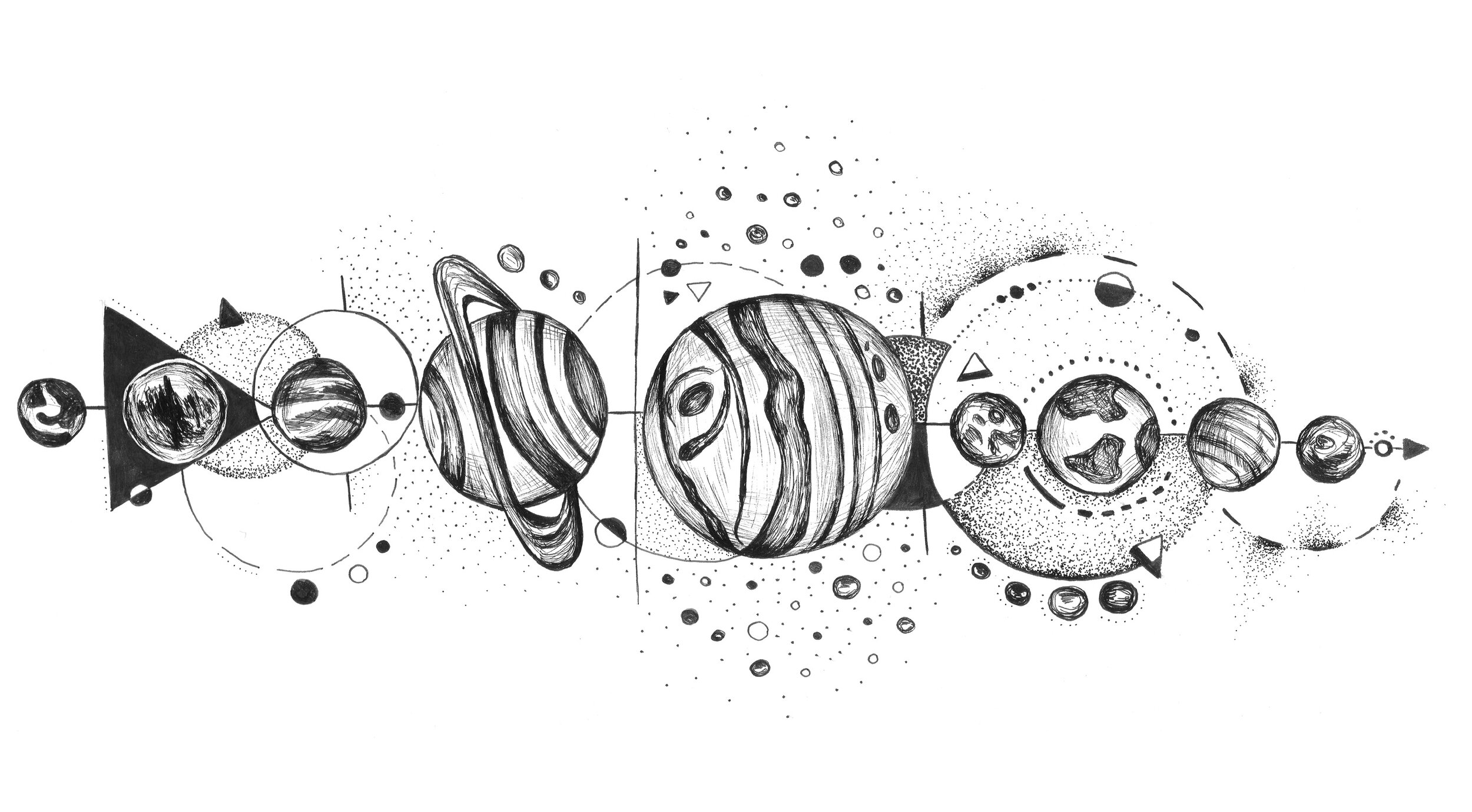
My illustration draws inspiration from the alignment of the planets that occurs every ten thousand years.
“The American Ephemeris," in August 1987 there was an exceptional alignment of planets in the Solar System.