Logo Design & Branding
Geeek’O Brewing Co.
When it comes to logo design, the ideas, creative juices and options can be endless. At Hoot Design Studio it all begins with a pencil sketch. That’s right, paper! My creative process and original design work flows best from my think tank on my shoulders to doodles as I explore the possibilities. Ideas and concepts are hand crafted before the design work even hits the computer. Essentially my iMac is nothing more than an artist’s tool to finesse and finalize my work.
No clipart or stocks images here!
My vectors are built from scratch to create one-of-a-kind designs that are as unique as you are. Your brand is special, shouldn’t your logo design follow suite? After all it’s the front end billboard to your company, your vision and the products or services you provide.
The Creative Process.
It is not an app and it is certainly not a quick pick from a catalog. Would you pick your tattoo design from a flash sheet of images 1000’s of other people have. Or would you want something custom since it’s going to last you a little longer than a weekend? A good logo is well thought out from beginning to the end. It can be time consuming, fun and yes a little stressful. Your logo is your customer’s first impression and it should be timeless and memorable. Crafting the perfect logo is a rewarding journey of exploration, choices and decisions.
Logo design is an investment, not a price tag.


Logo Development Process
Since your logo represents who your business is, your goals, values and products it can not be designed over night. Having an easily recognizable logo plays an important role in your brand recognition.
Time well spent in the development process is an important investment.
Would you want a roofer slapping your shingles on your house quick just to get it done and out of the way? Or would you rather hire a professional that is going to make sure it’s done right the first time before you spot leaks or need another roof a year from now?
Below you’ll find a couple key steps in my logo design process and how I ensure you receive a quality logo that represents who you are, appeals to your target market (the folks you’re selling to) and is works well for an application - from business cards to embroidery and screen printing. A versatile logo is a good logo. Think of the McDonalds golden arches, FedEx, Subway or the classic Nike swoosh. Clean timeless design that is easily recognizable.
Step 1: Briefing & Brainstorming
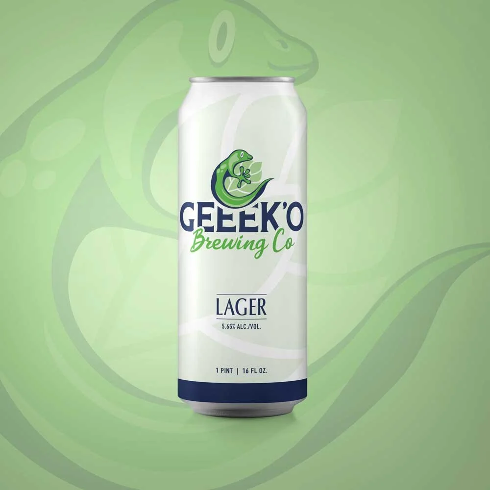
Before I can create a logo that represents the WHO in your company, I need to know more about your business, product or service. For Geeek’O, Brewing Co. they are located in Florida and have a client base in the tropical area of St. Augustine. They were looking for a logo that represented the area with a fun play on their name derived from the wild geckos to the locals passion for jeeps. (hence the extra e’s in the their name)
During the initial design briefing stages, I look to understand your culture, vibe and the target market you are trying to reach. In this particular case study, Geeek’O is located in the deaf community of Florida’s beaches. We wanted to establish a strong icon vs. custom lettering that visually represents the area as well as the refreshing crisp beers they will offer.
Step 2: The Research
After understanding the vision, I typically ask the client to provide a mood board or a collection of images they like. It may be other logos and brands they find appealing or even nearby competitors - in this case other local breweries. I dig in deeper myself as well. I want to see what the other taprooms and breweries in the area look like so we are not copying the branding but also looking to elevate the new brand coming to the market so it stands out. I start stock piling a collection of images from photographs of lizards, Florida sunsets and beach inspo. Who is Geeek’O? What does the atmosphere around the brewery look like? How can we incorporate the vibe and culture into the brand?
Step 3: Ready to Design
Let the fun begin! As I mentioned before, my creative process begins on paper. Yep, bust out those pencils. I start sketching ideas based on the research and creative briefing. This stage is rough, loose and it helps us to get the ideas flowing. I like to share my beginning thumbnails with the client before taking it further just to make sure we are on the same page. Once a concept is narrowed down, I begin to work out the kinks in Procreate refining the design a bit further before taking it into Adobe Illustrator and creating the final vector.
Step 4: Review
After the digital art is reviewed and discussed with the client, the logo is ready to be born as a vector! This final process can be the most time consuming part as the creative illustration is manually drawn one click, point and curve at a time.
Gander my video here on the beginning design stages.
Step 5: More Design
We’re not done yet!
Once the icon is created, if the lettering is not custom drawn, I explore typefaces. Pairing the logo with a font that works well with the brand is key. I like to choose fonts that match the personality of the brand and are easily readable when shrunk down to the size of a postage stamp. You must think about all applications and usage of the logo. I rarely use a font as is. As seen in the Geeek’O logo I altered the font with curves and create a negative space cut out around the icon to separate it and just enough to give the eye a place to rest. Pairing 2 fonts in a design can help make it more dynamic and add a contrast of style when needed.
COLOR! Wait, there’s another step?
Yes! When designing I begin with just a black and white design. Good logos must work in a monochromatic color palette for many reasons. You will want to envision what your logo looks like on black substrates, dark colored fabric, what if it’s cut vinyl for vehicle lettering? There are a lot of things to consider and keep in mind.
Once we’re ready to explore color, I typically provide several versions to review and narrow down before finalizing the perfect shade. Does it need more cyan, too much magenta? For a professional logo I can provide PMS color swatches as well as the CMYK and RGB breakdowns which is very helpful when printing your marketing and making sure your color matches from piece to piece. What if the McDonald’s logo showed up more orange on some print marketing and mustardy on their t-shirts? Color matching is important when establishing your brand.
Step 6: Final Deliverables
Yah! We made it!
After a few round of revisions, color tweaks and font adjustments your logo is designed JUST FOR YOU! Nothing else out there like it. (oh ya, did I mention another round of review to search Google just to make sure!) Feel free to connect with an attorney and file for copyright or trademark at this stage.
Hoot Design Studio will then provide high res files including the raw Illustrator file, vector eps, web ready jpeg and png with transparent background. I will also provide the icon and text as separate files. For instance with the gecko icon, it would look way cooler to have this a the round symbol for your Instagram page than the full logo as it would be smaller when cropped to the circle profile photo.
What’s next?
If you need help designing business cards, a tri-fold brochure with your products or rack cards, I would be delighted to help. You have an awesome new logo, let’s put it on everything from postcards to announce your new business, to signage, banners and cool t-shirts for your employees.
I can also establish a branding guide for you. What is this? Typically a pdf or printed sell sheet or brochure that explains who your brand is and the do’s and don’ts of your logo. So if you have a printer, collaborate with another company or have marketing designed this guide will tell folks how your logo can be used. For instance the Geeek’O Brewing logo may not change colors. You may not make it pink, separate the hop from the gecko or skew and distort it in any way.
Ready to get started?
I’d be honored to bring your vision to life! Contact me at the link below and tell me a little bit about your new business. - or if you are looking to re-brand! I’d enjoy setting up a FREE discovery call with you!