
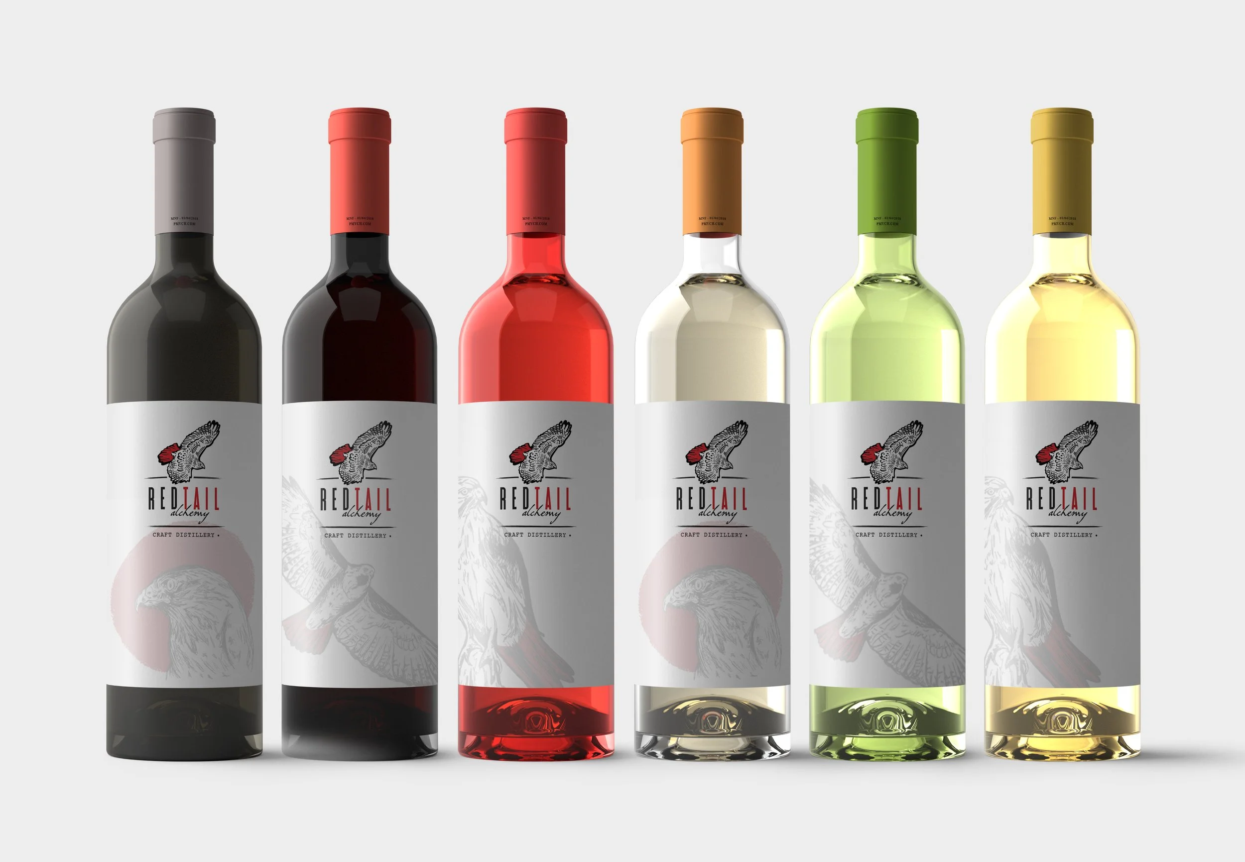
Red Tail Alchemy Winery & Craft Distillery
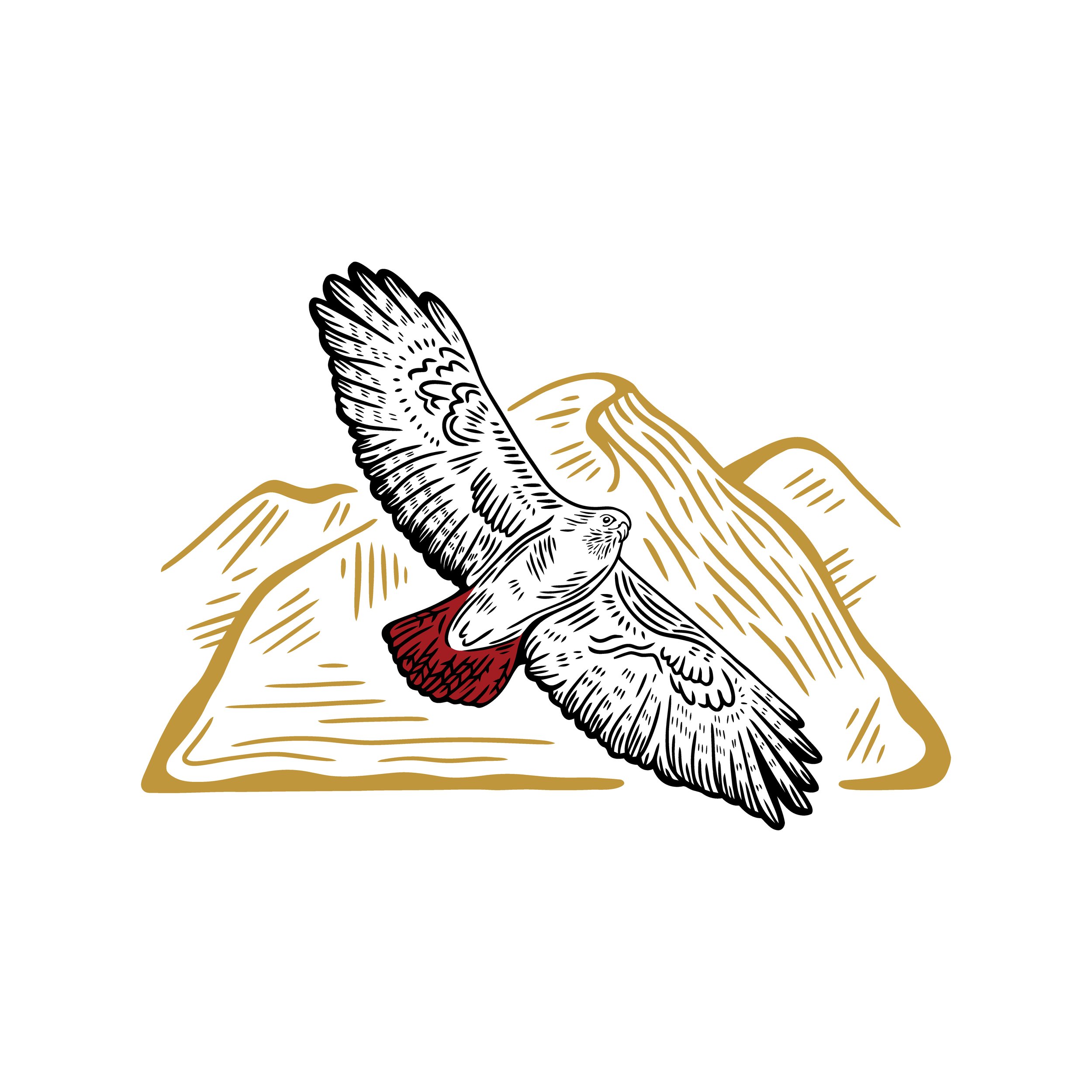
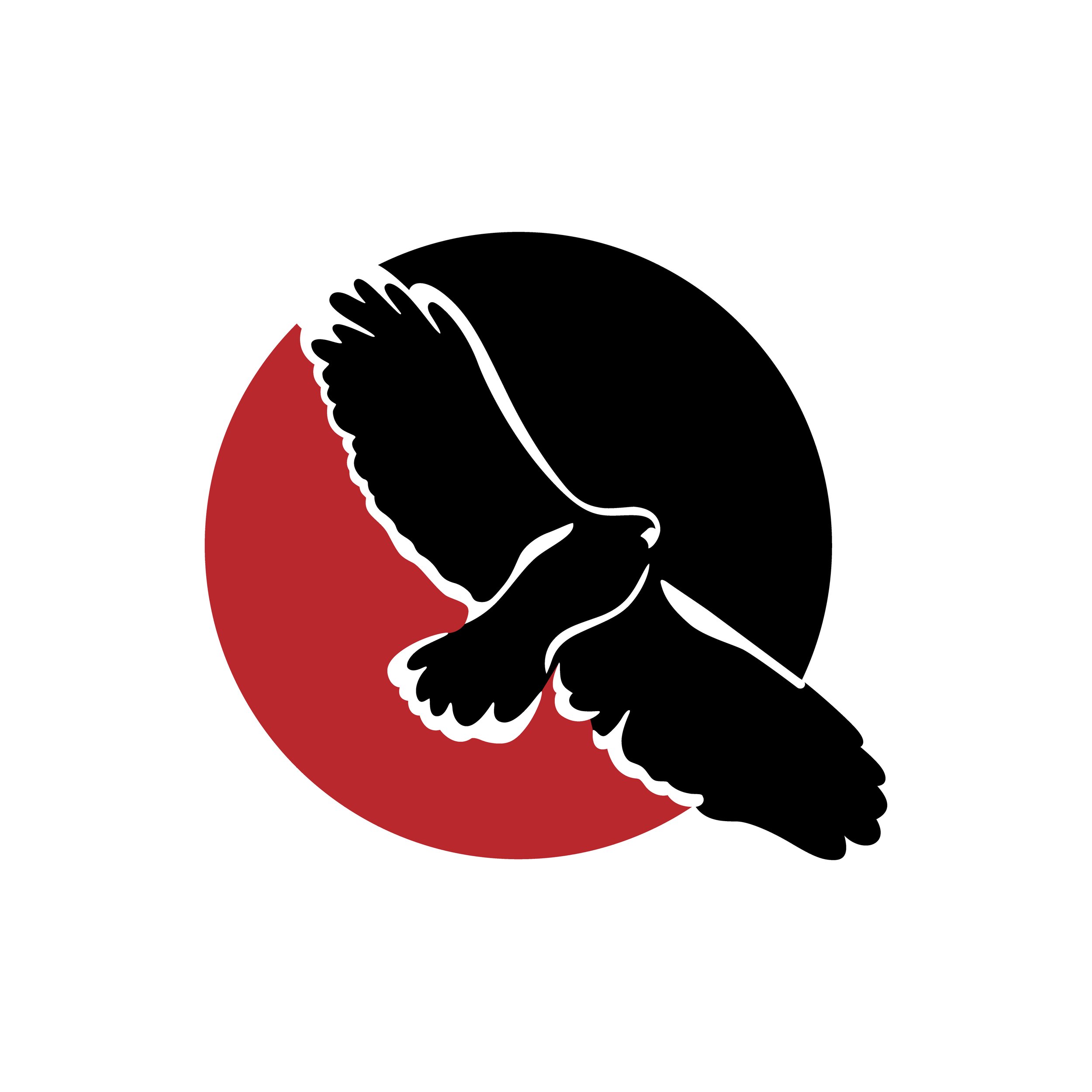
Red Tail Alchemy is a winery, cidery and soon to be craft distillery located in Nescopeck, PA. The brand is community driven and needed a logo that is approachable, hand-drawn and represents the quality and craftsmanship of the wine. Hoot Design Studio designed a primary logotype with a secondary horizontal option to allow for versatility in the usage from print marketing to web design. A third mark and monogram of the red tail hawk was designed as a simplified option for small printing and embroidery. The style mimics a wood cut engraving look which adds to the vintage vibes. Timeless.
Hand-drawn sketches
Exploration begins with studying the anatomy of the Red Tailed Hawk with various poses. Should the hawk be perched, a close up of the face or soaring in the sky to represent strength and determination to succeed? In the thumbnail stages of logo design, I explore loosely a few options.
While we can get more detail in an illustration / line art, this sketchy style does not make a good logo. This works better as illustration for the label.
A good logo:
• Works well at any size
• Is stylized. Small details are lost when reduced to the size of a postage stamp
• Works well in black and white
• Can be embroidered or cut into a vinyl sticker - think the Nike swoosh!
• Clean, simple and versatile
• Graphic in nature as opposed to a full drawing or painting
• Functional. Too elaborately drawn logos are not easy scalable
• Works well in print and web


Thinking outside the box:
The name of the brand is Red Tail Alchemy. Does that mean you have to show the tail? what if we show the red in a circle. Apple Computer does not show a computer icon. Nike does not show a shoe.

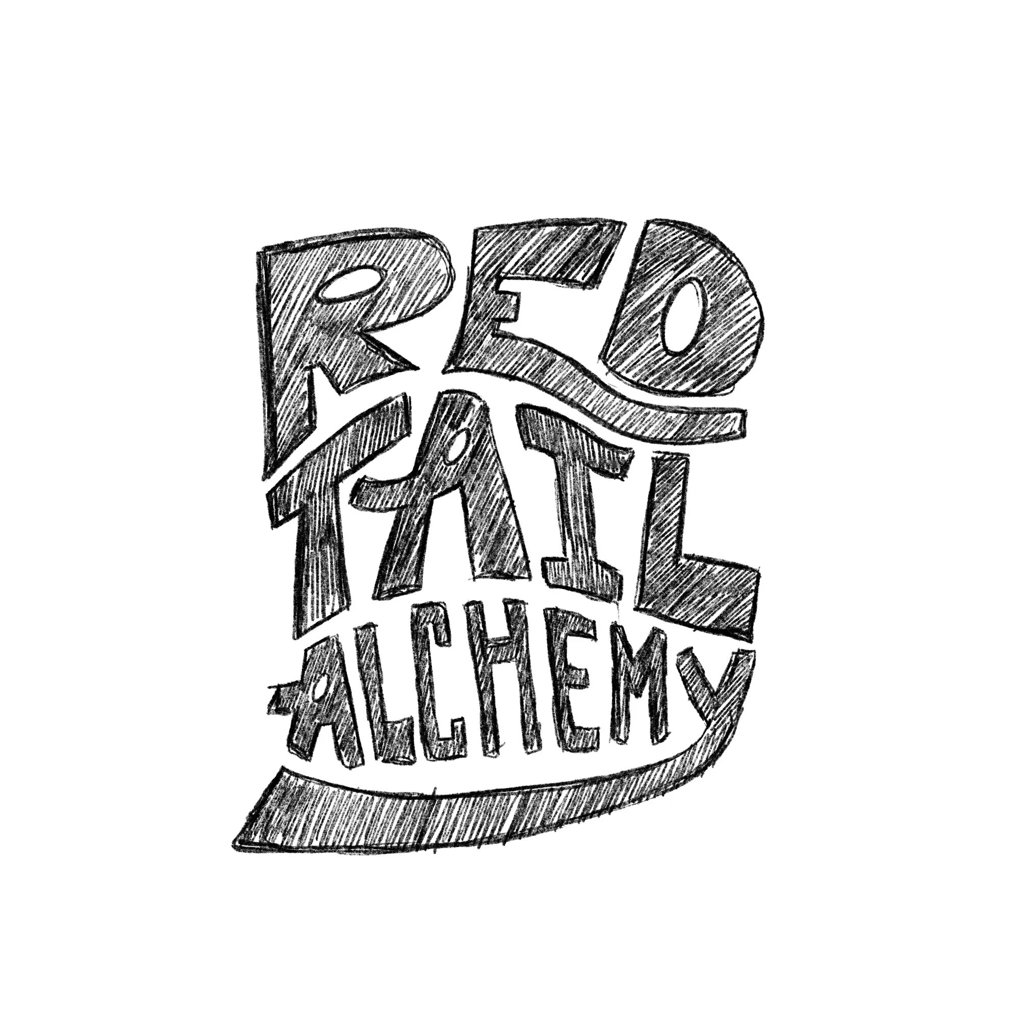
Hand lettering options are explored


There is power in the packaging.
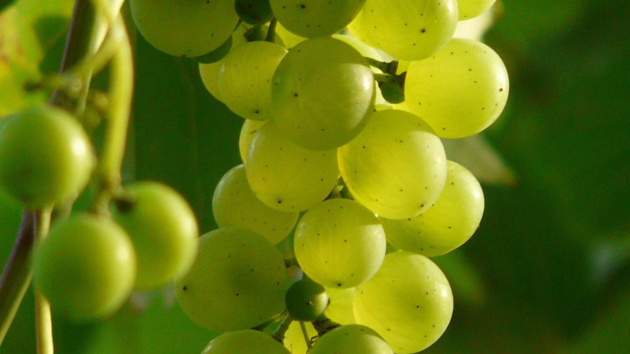
A well-designed label grabs the customer’s attention and invites them in for a taste. The first impression of your brand and wine is based on what the customer sees on the outside. Most wines are first purchased in reference to the label art and packaging. Customer’s relate to the imagery, typography and design at a glance and immediately judge the quality of the wine inside.


Let’s Work Together!
Are you starting a winery or craft distillery and need a timeless logo and branding to tell your story? I’d love to work together and bring your vision to life.