
Crack The Can: The art of beer label design and illustration
Great can design starts before the artwork.
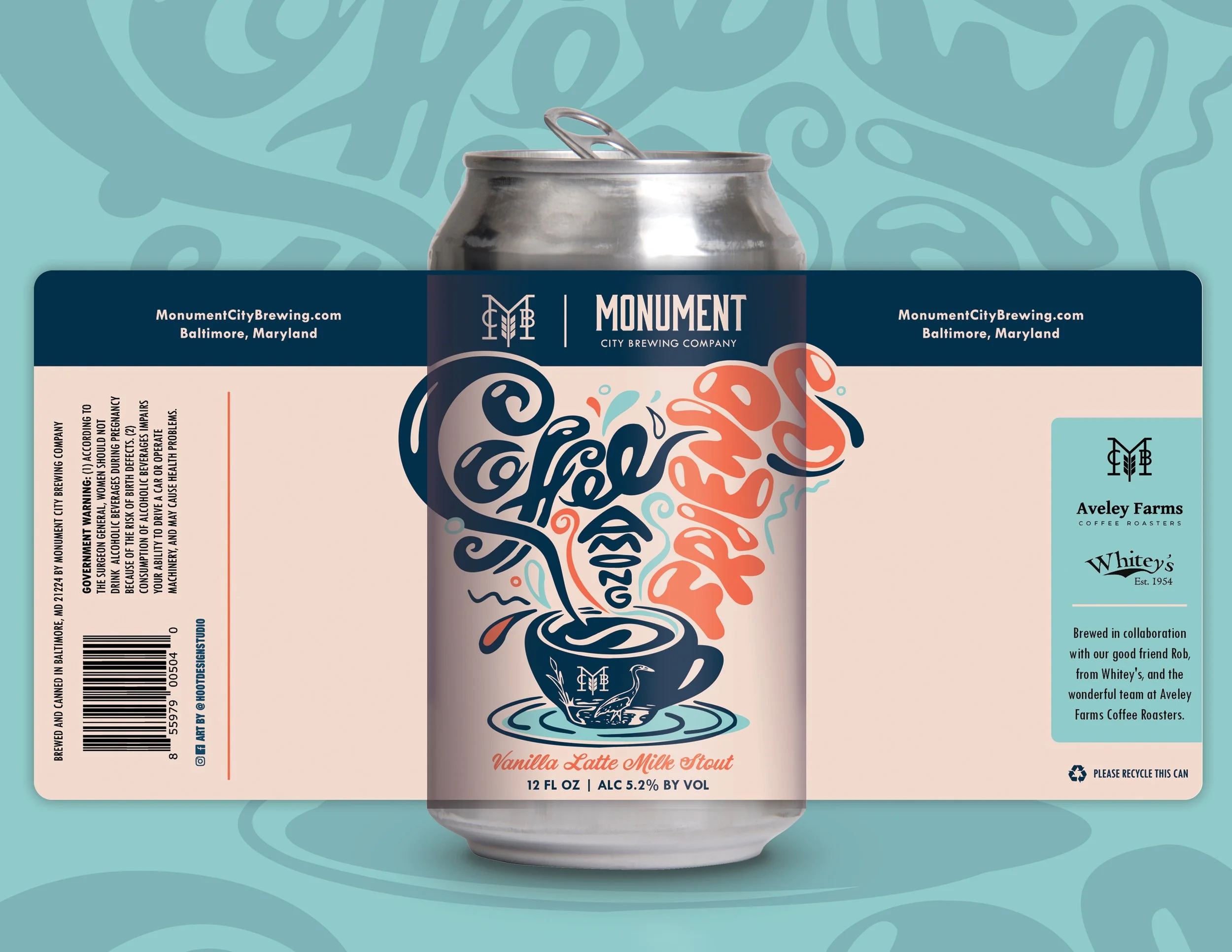
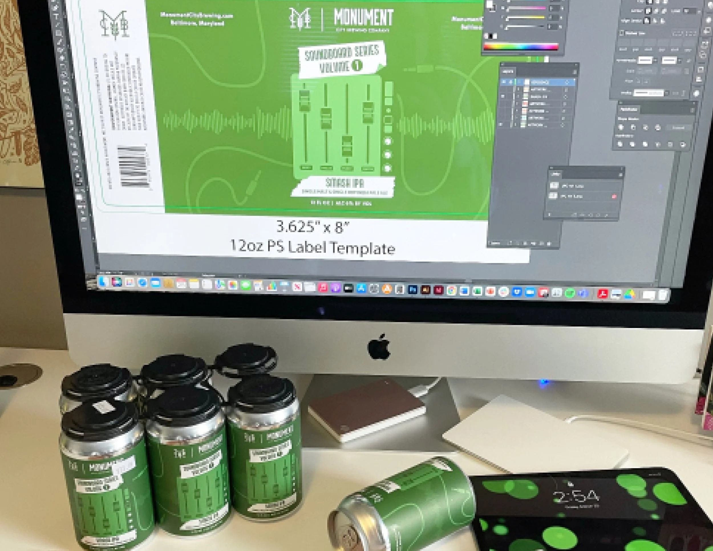
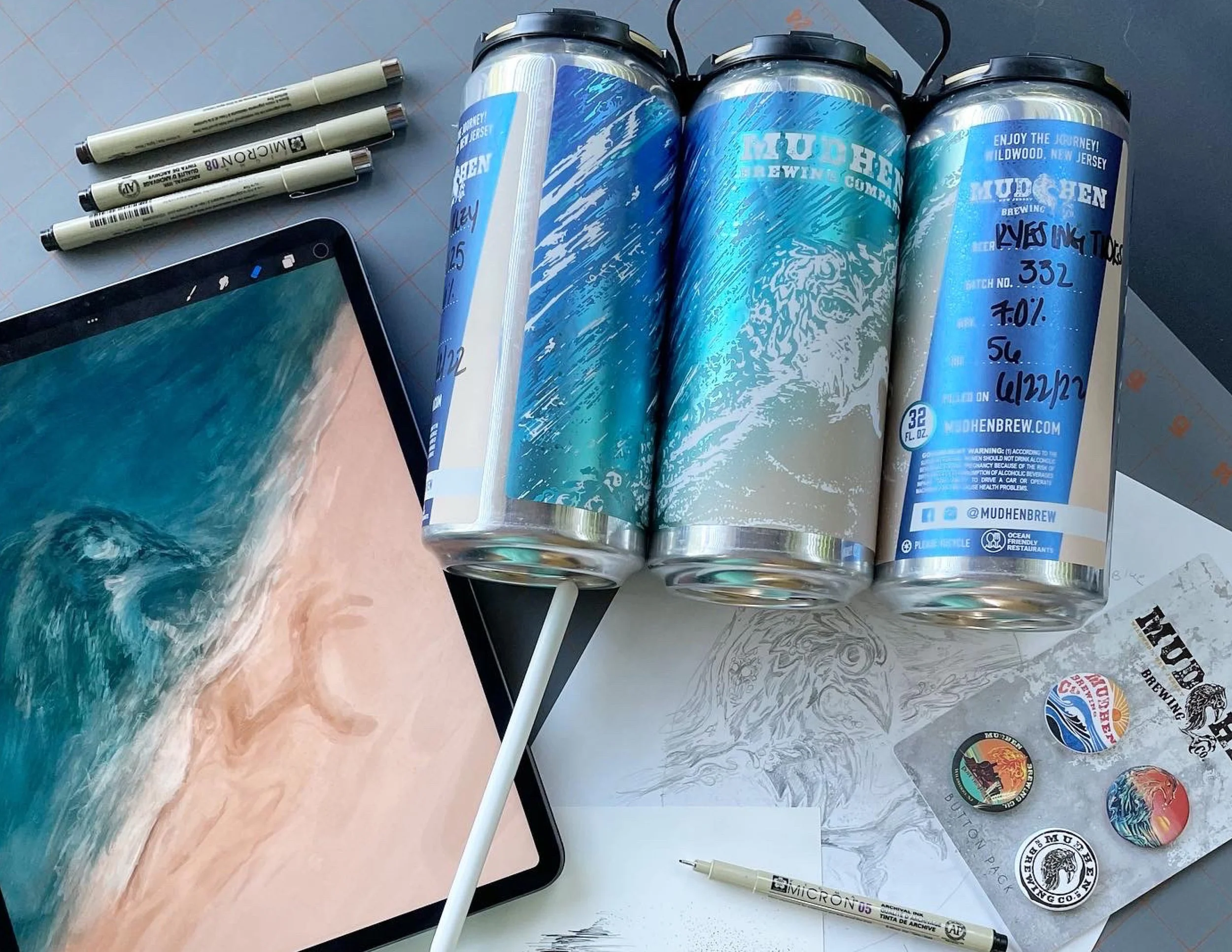
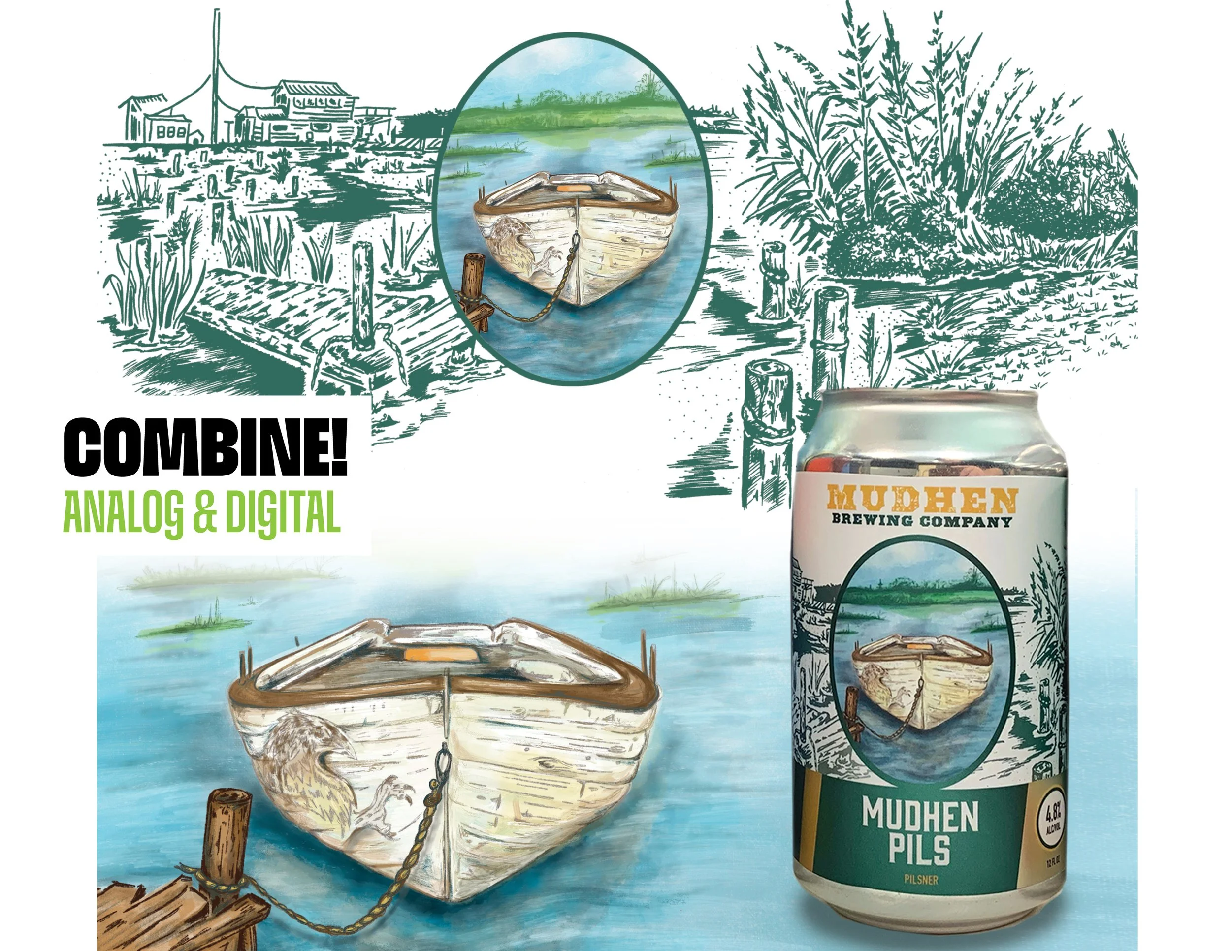
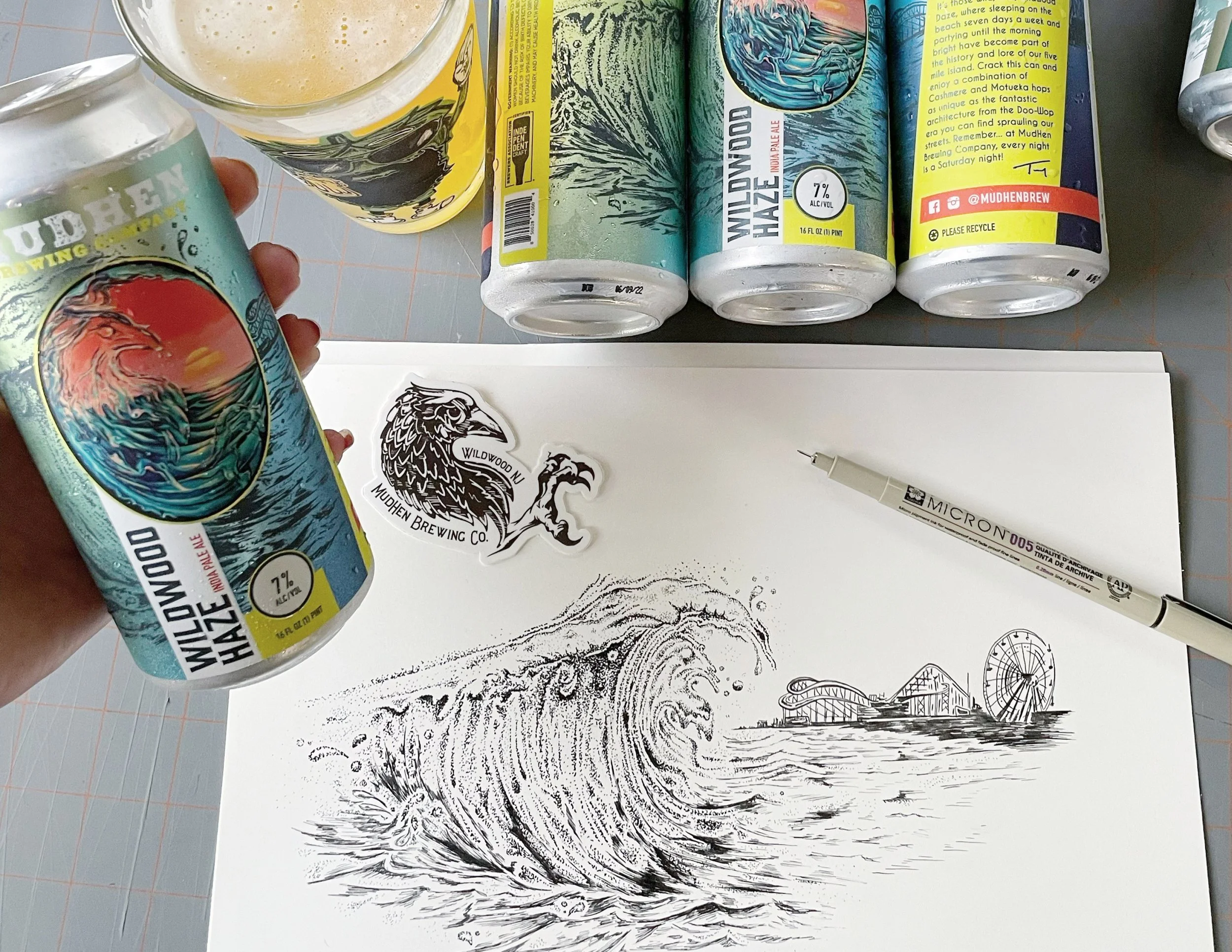
Designing for printed aluminum cans means thinking beyond the artwork - considering seams, wrap, metallic surfaces, readability, and how the design actually lives in someone’s hand.
The best packaging design happens when production and creativity work together seamlessly.
Big thanks to Steve Spatucci and the Society of the Sacred Pixel for the invitation and the engaging conversation. Always inspiring to connect with people who care deeply about design and craftsmanship.
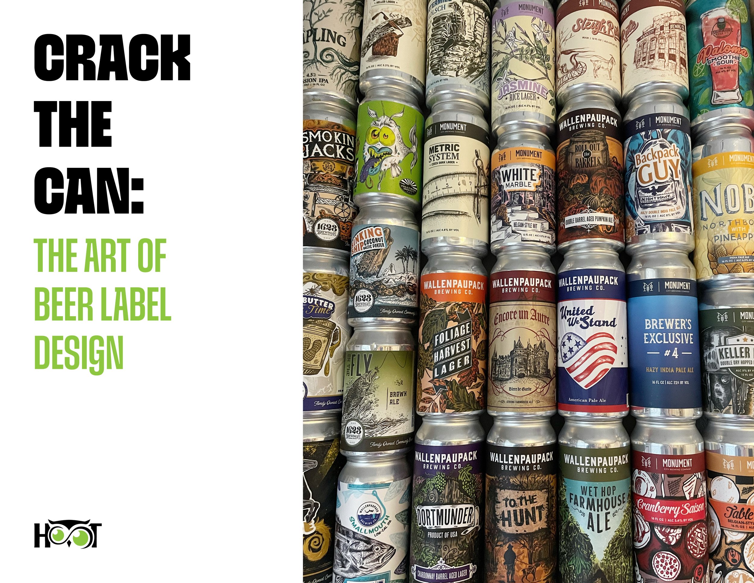
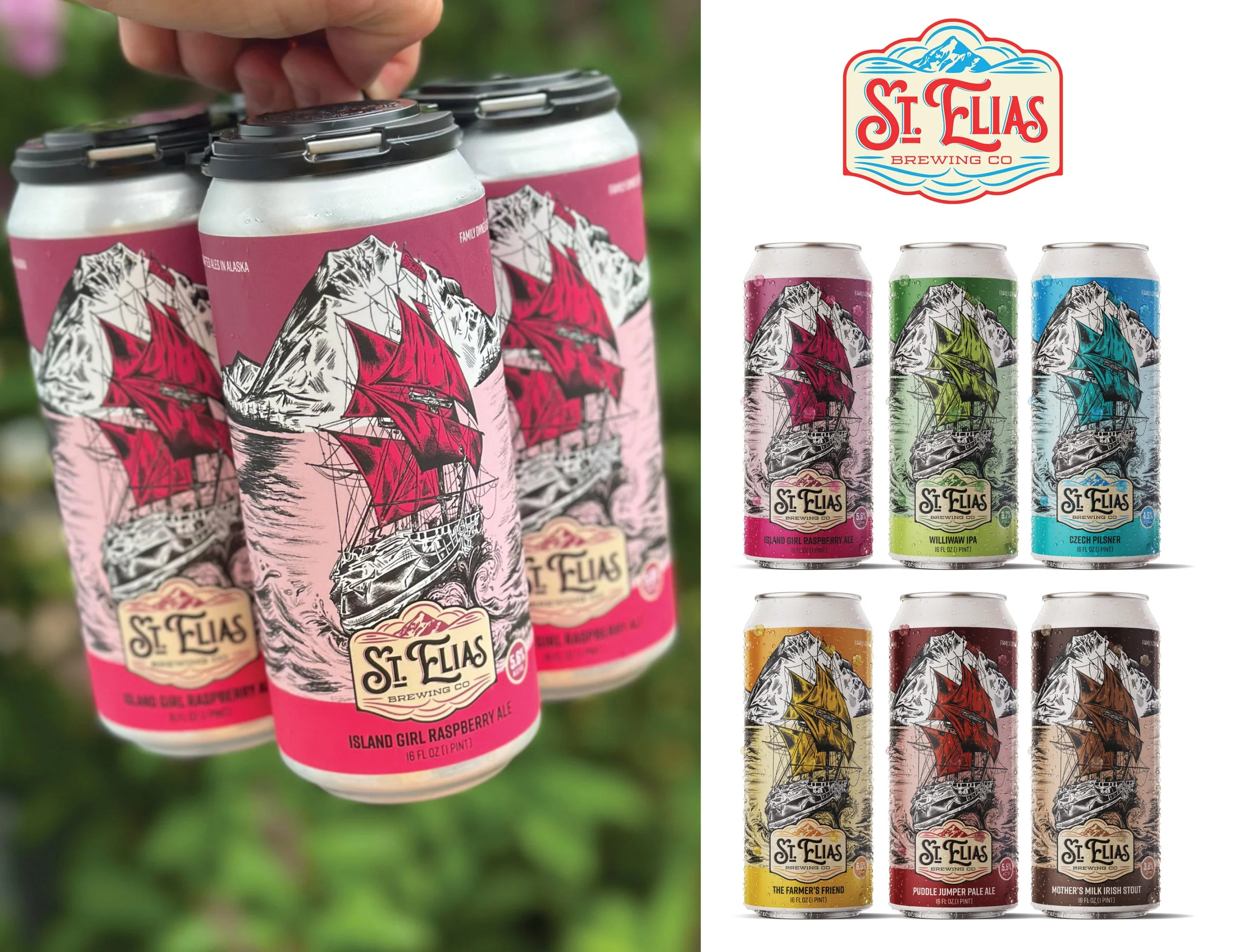
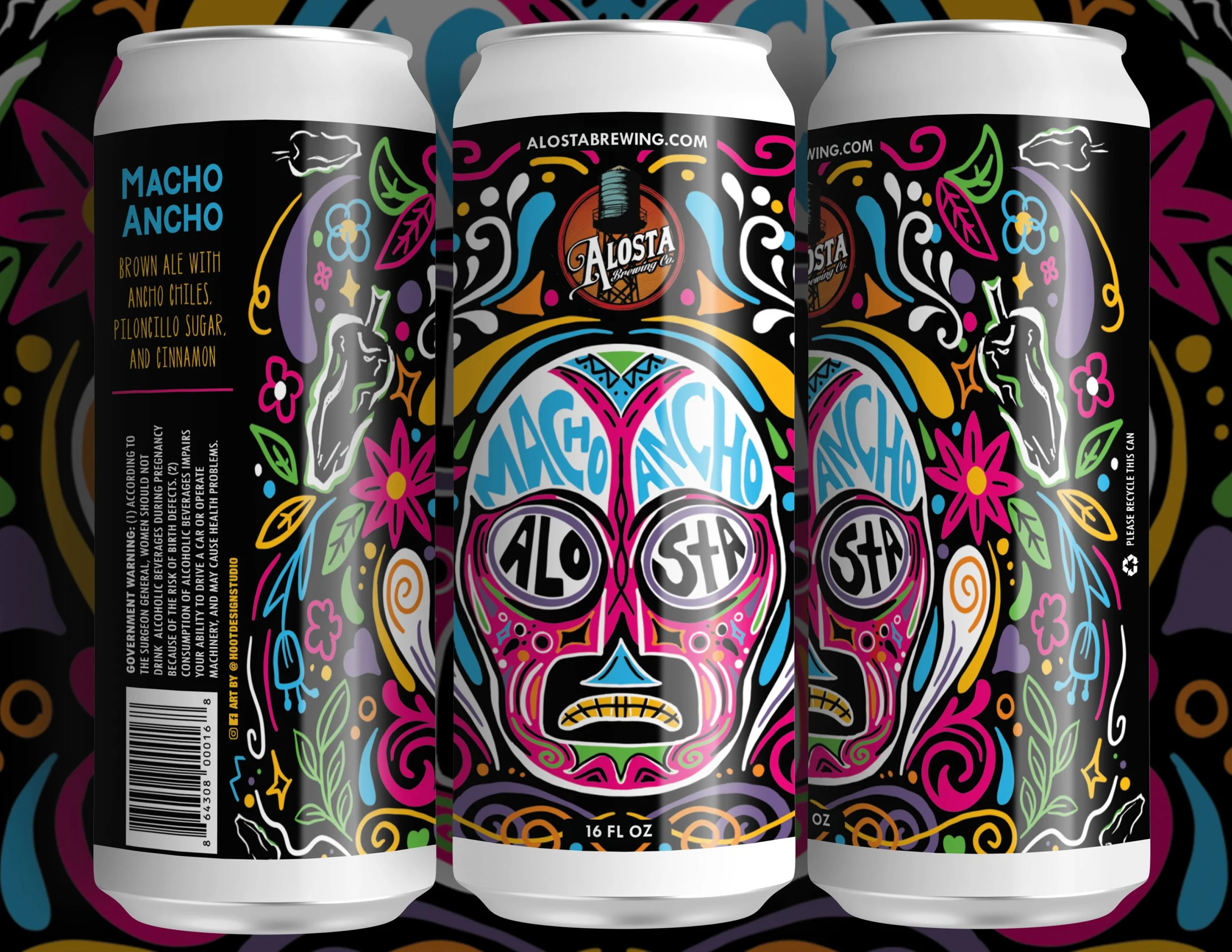
Crack the Can: The Art of Beer Label Design, will explore my process for designing and illustrating packaging for craft breweries and beverage brands as well as WHAT MAKES A GREAT BEER LABEL.
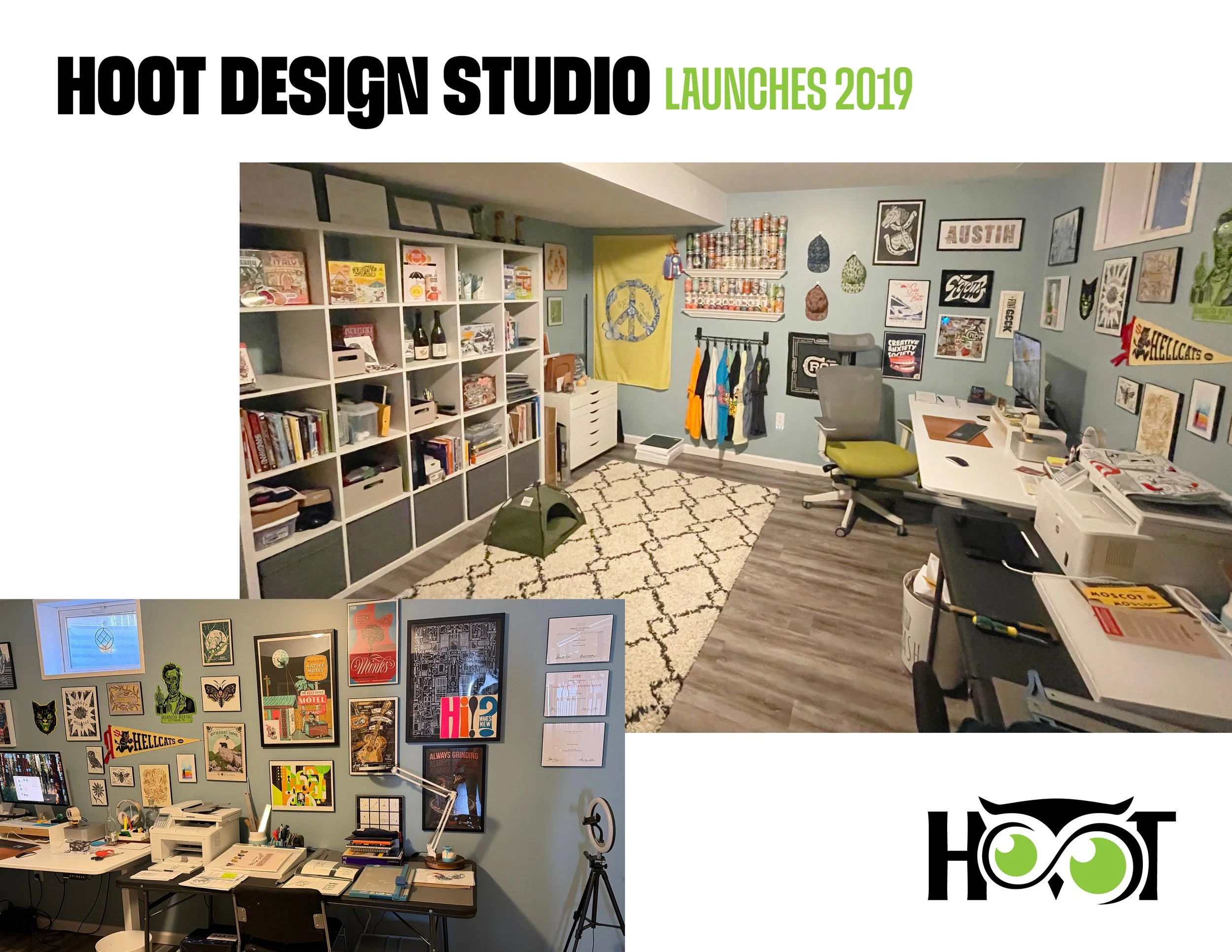
Here’s a peek into Hoot Design Studio and where beer labels and packaging design are created. Most days you will find me here at my desk at the computer or drawing at my draft tables. I love surrounding myself with art from fellow peers for inspiration.
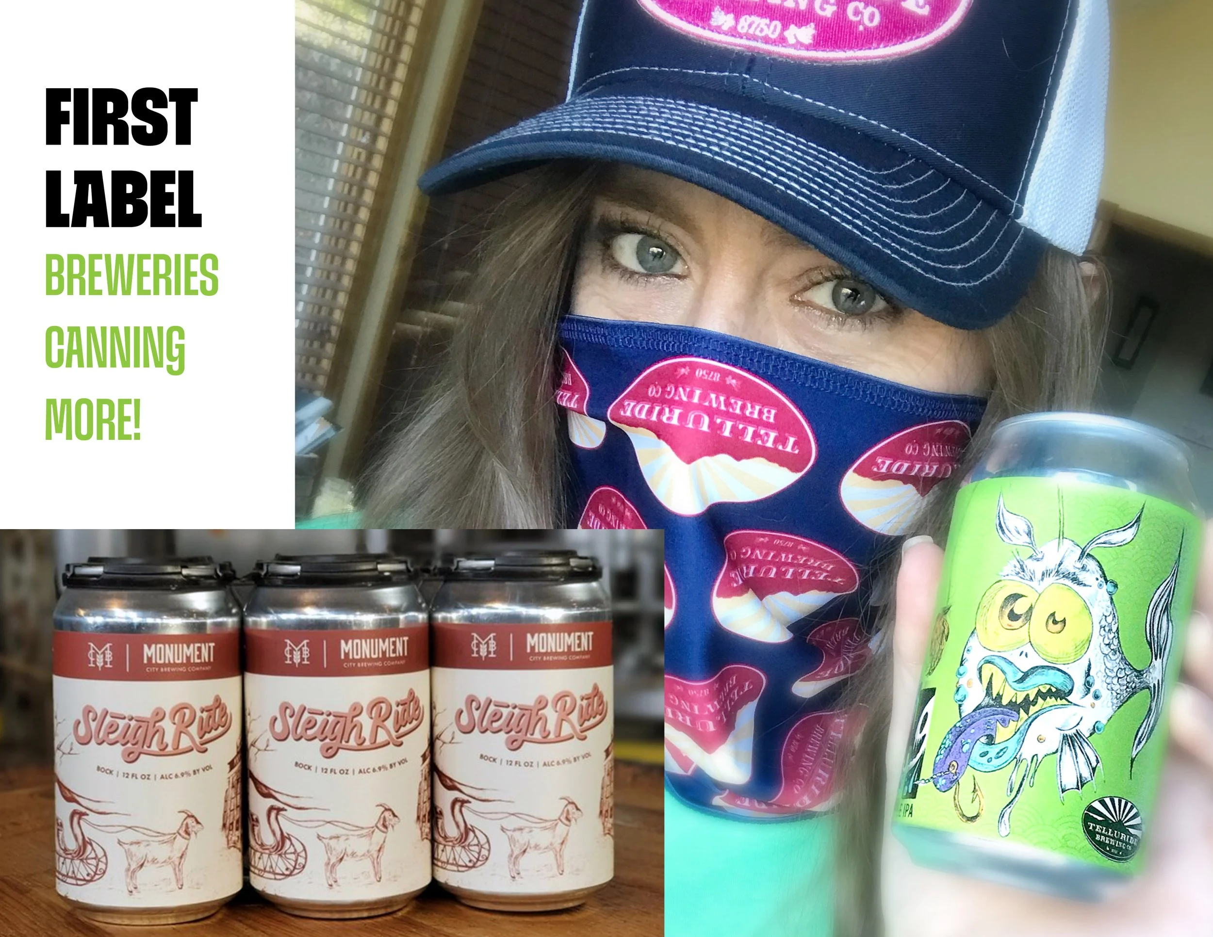
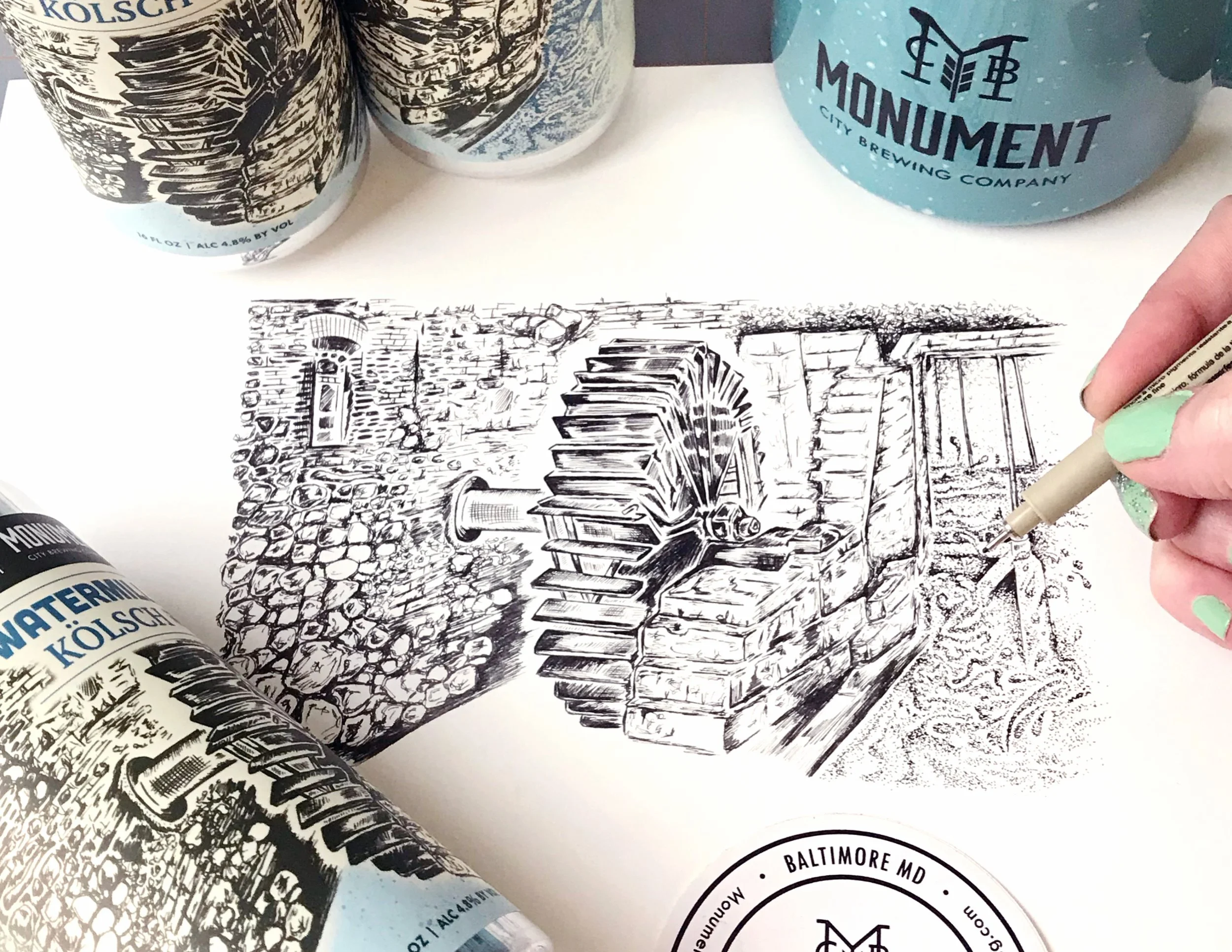
The pandemic was a time when breweries were canning more. Covid meant taprooms and restaurant kegs sales were down, leading to a flood of new beers being canned for to-go sales. During this time, I designed more labels than ever including converting 12oz existing cans to 16oz labels because of the aluminum sleeve shortage for the 12oz size.
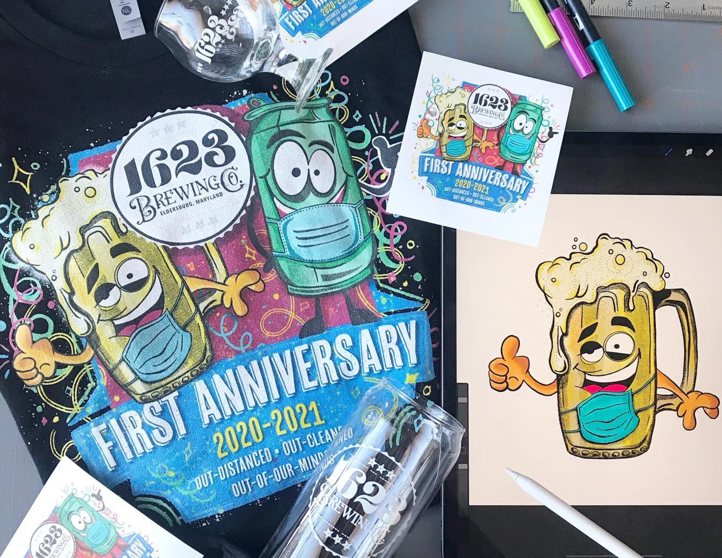
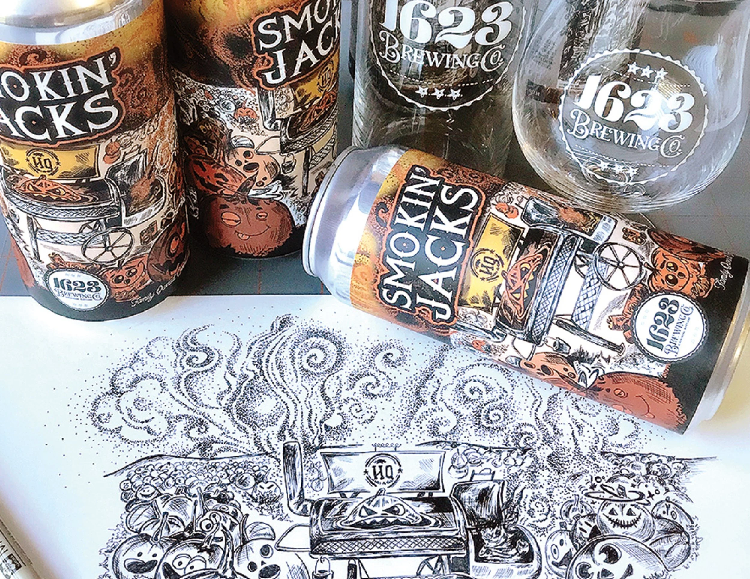
This was a fun cartoon style design of a beer mug and can celebrating the First Anniversary at 1623 Brewing Company and all the out distancing and cleaning that went into that era of the pandemic. I really enjoyed the art I got to create during covid.
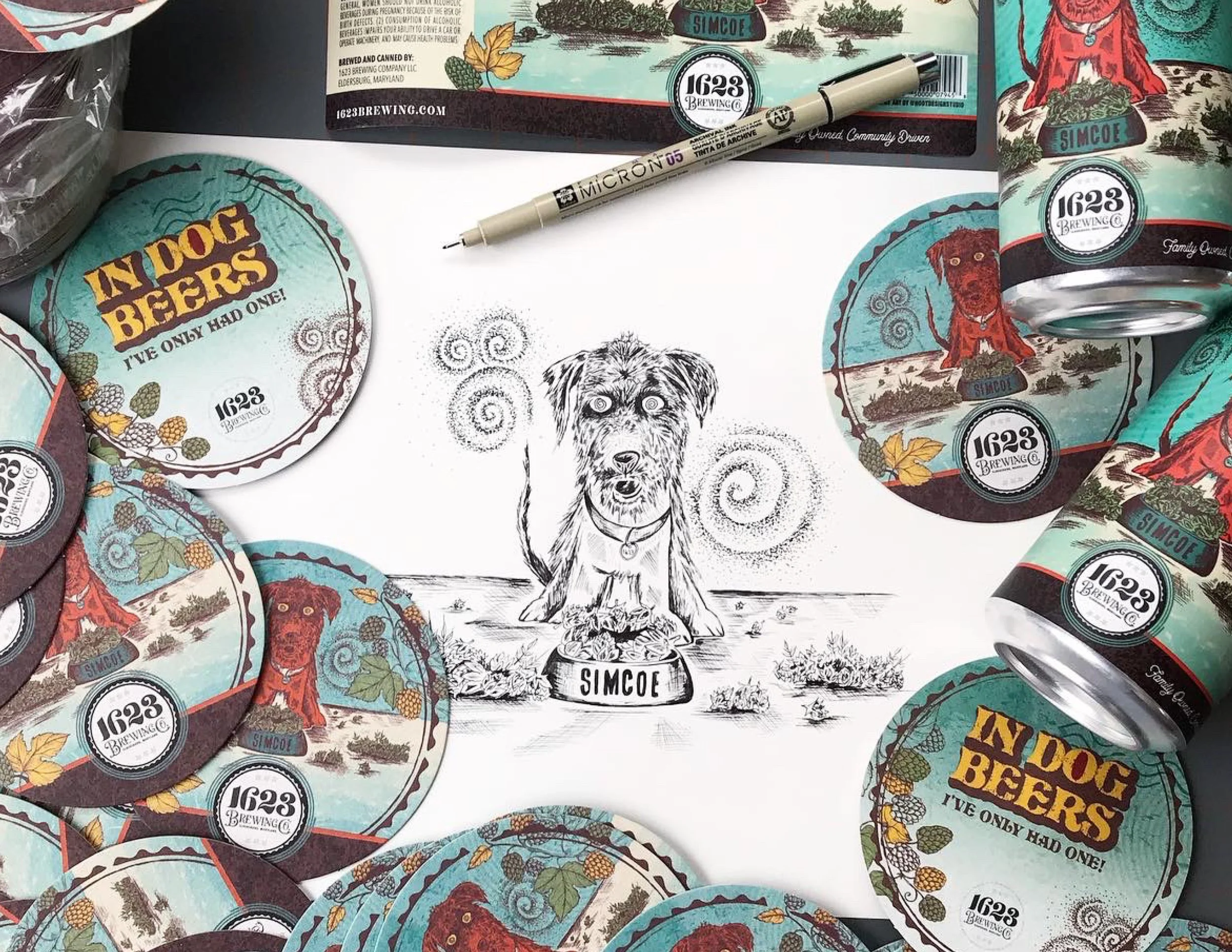
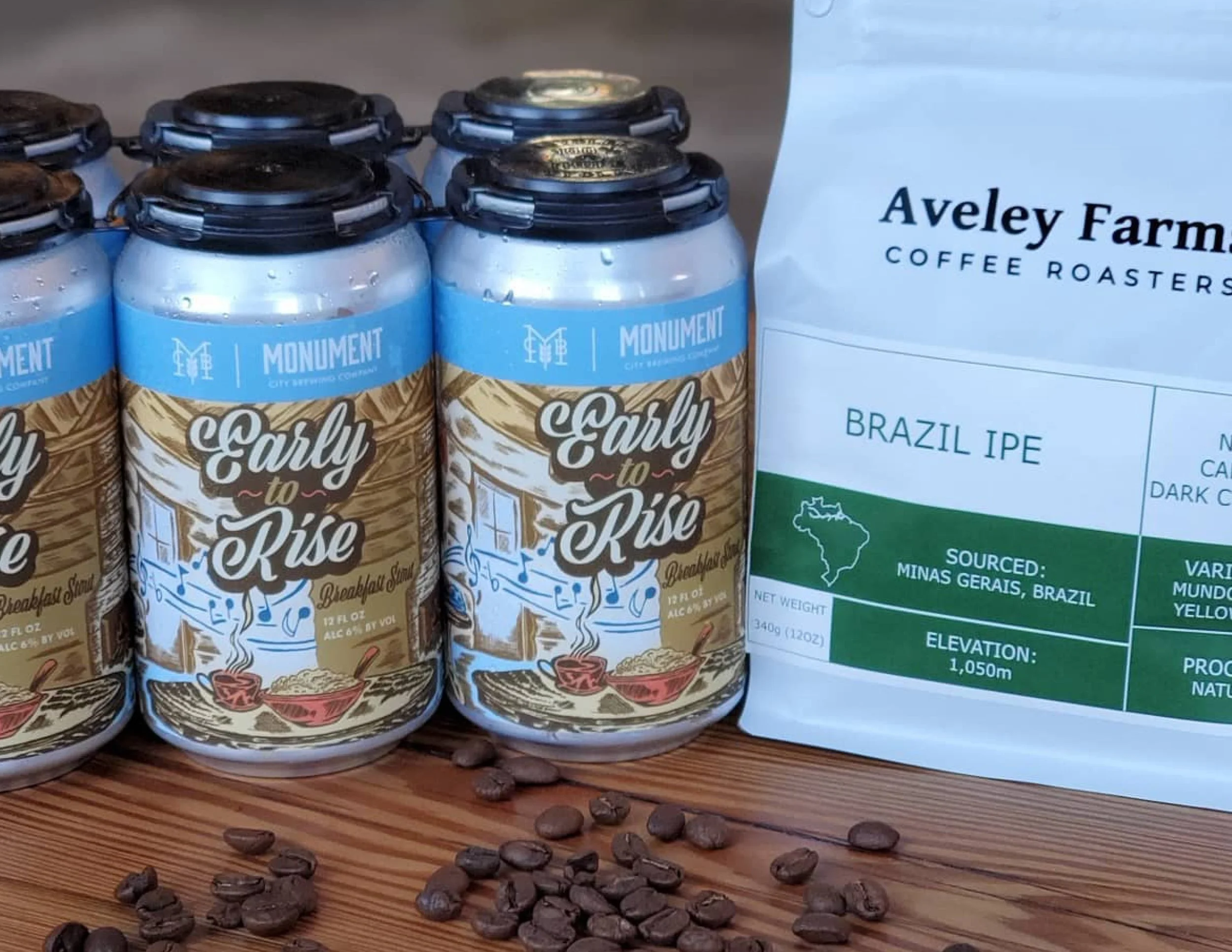
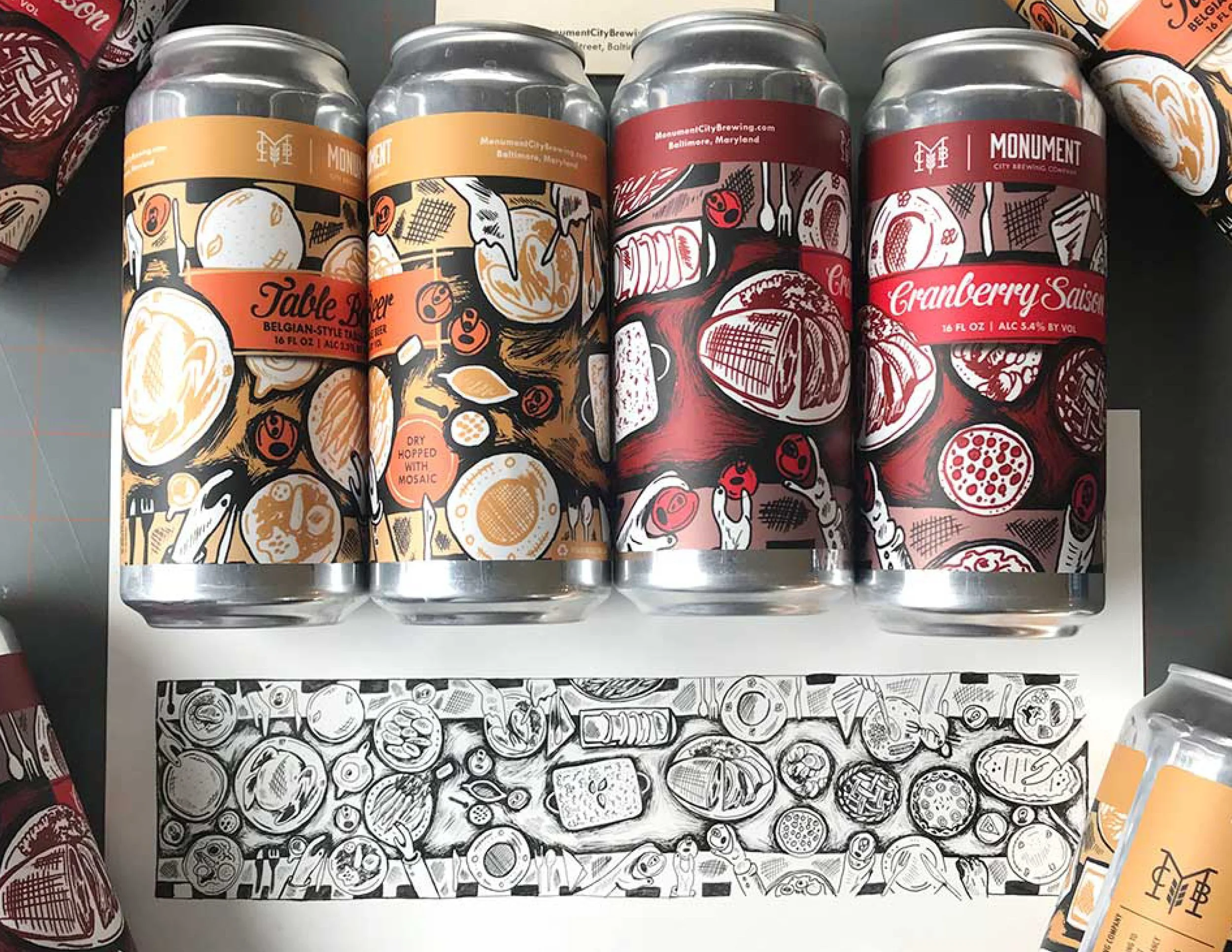
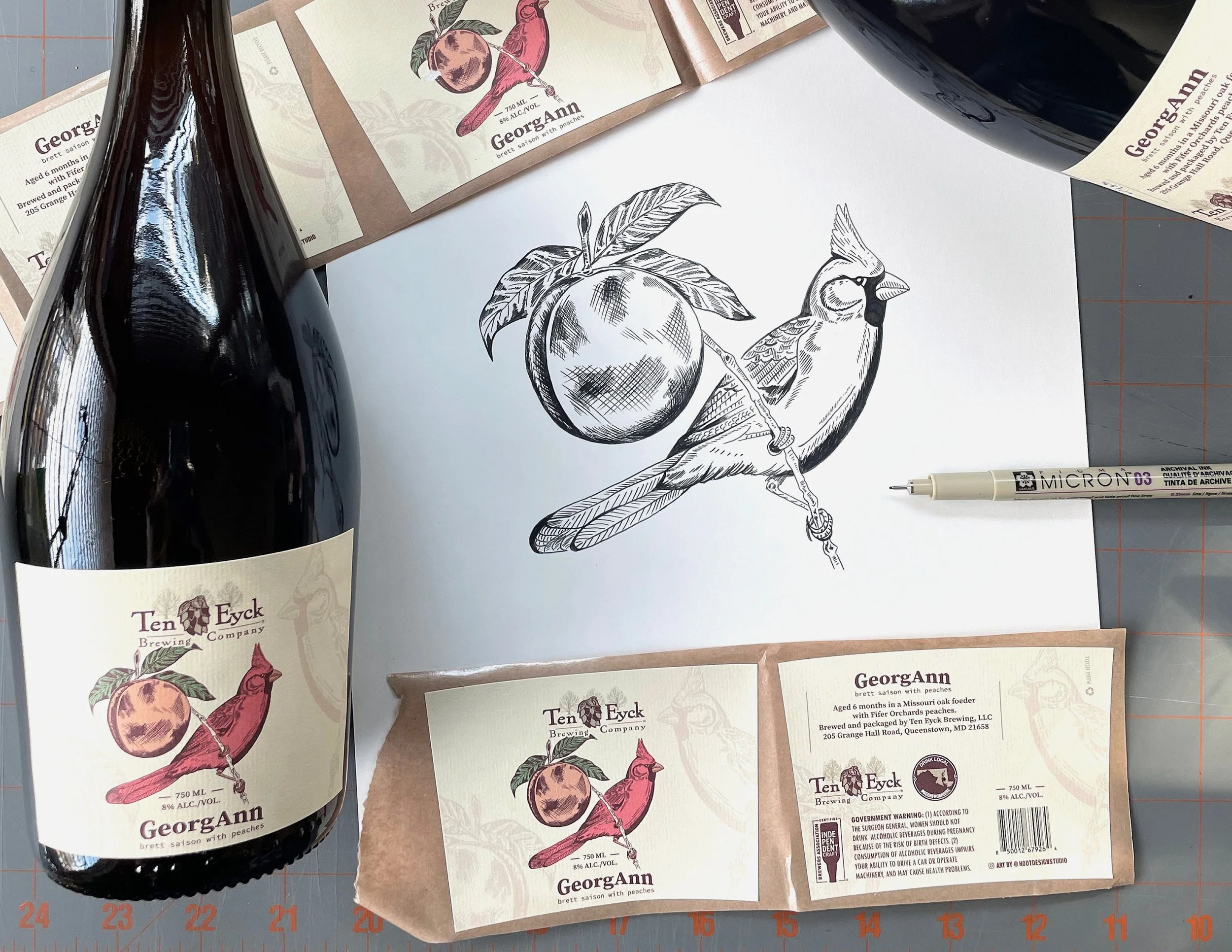
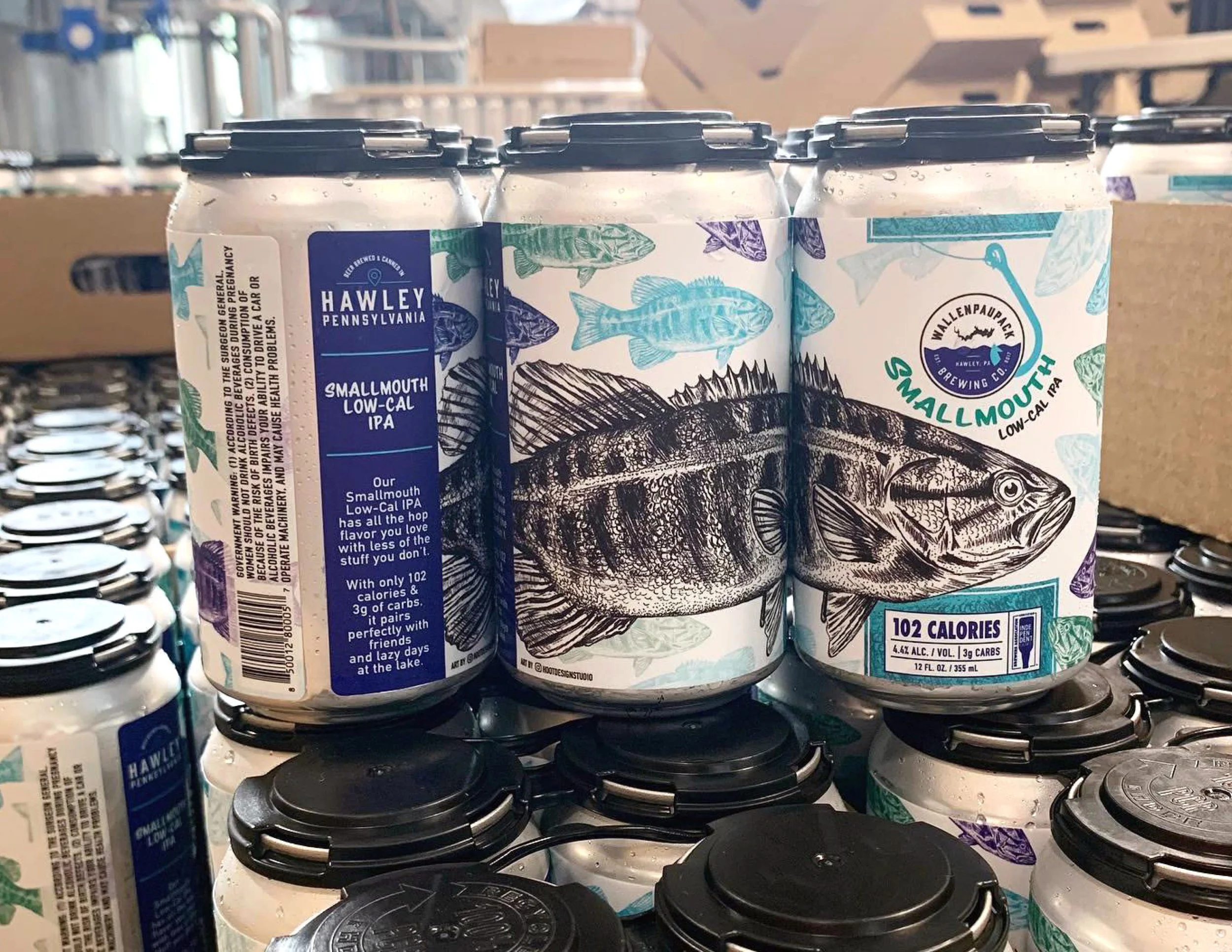
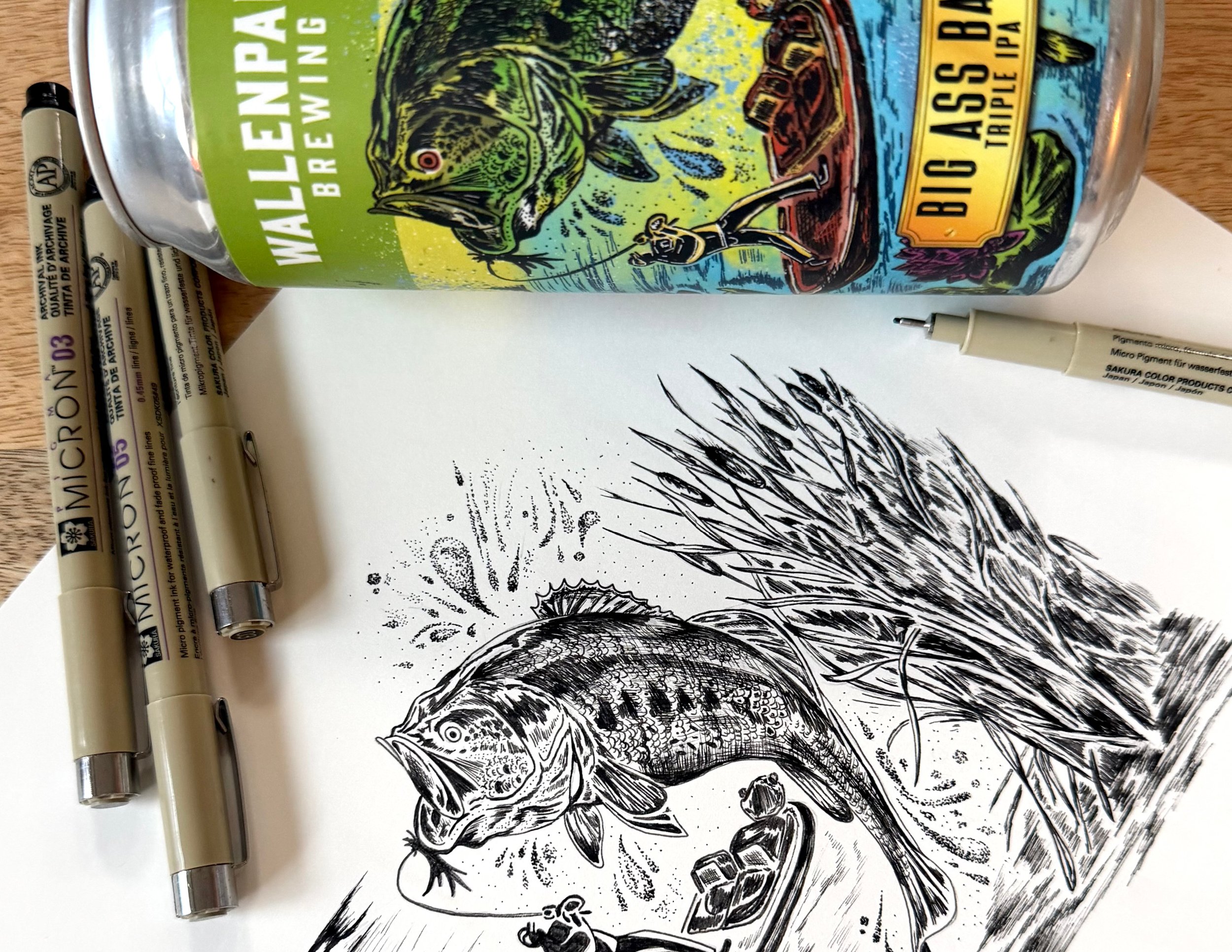
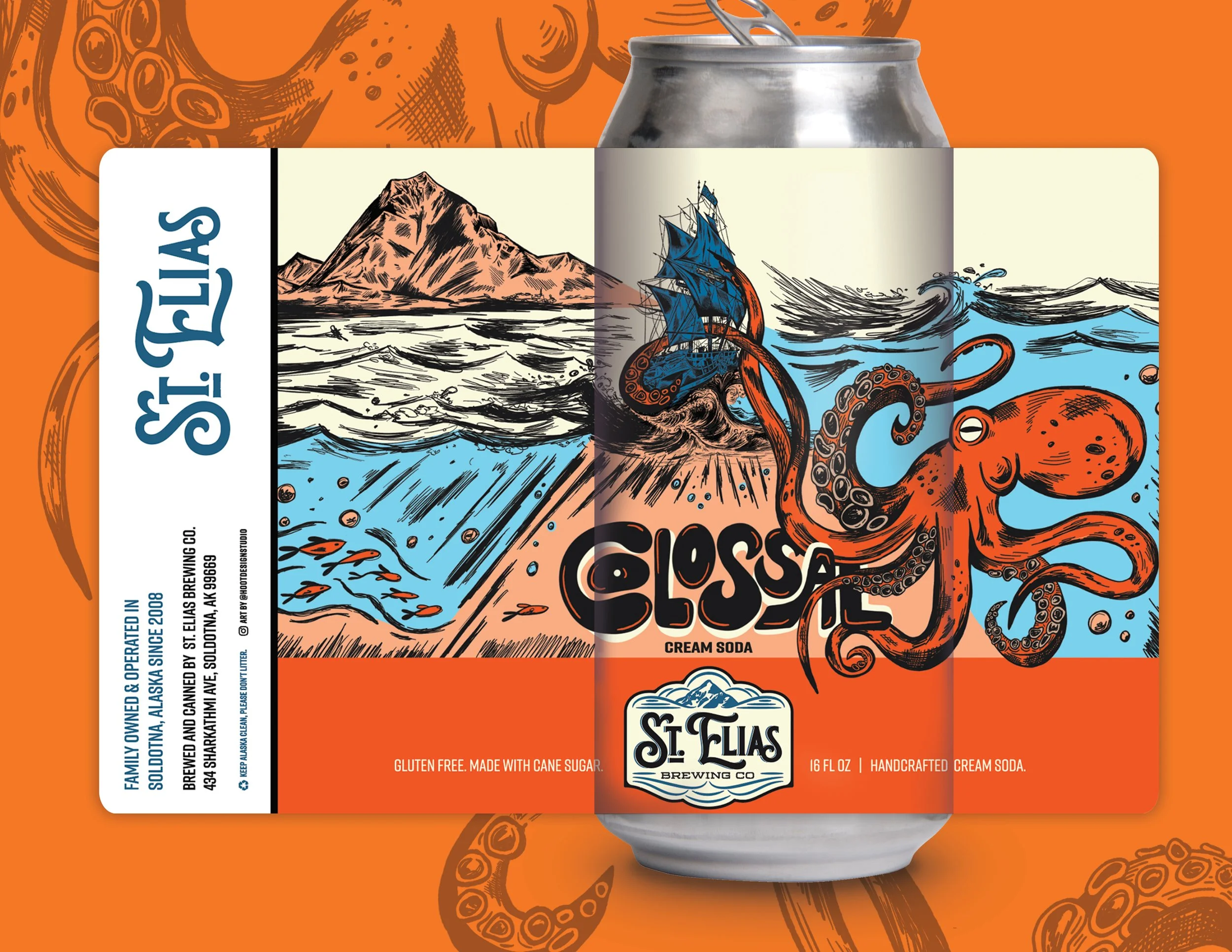
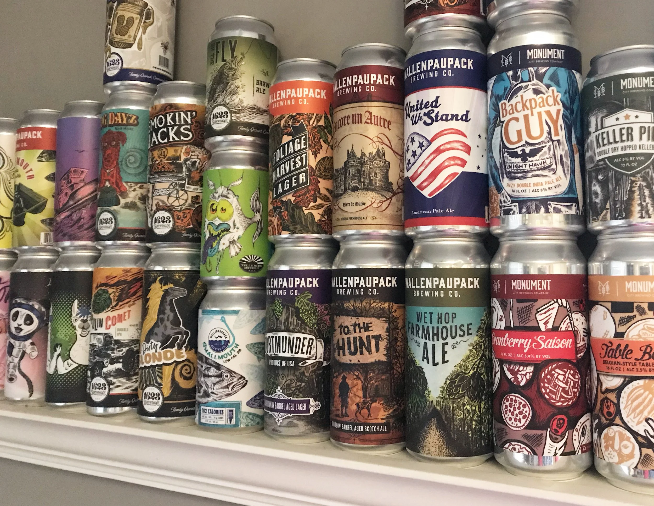
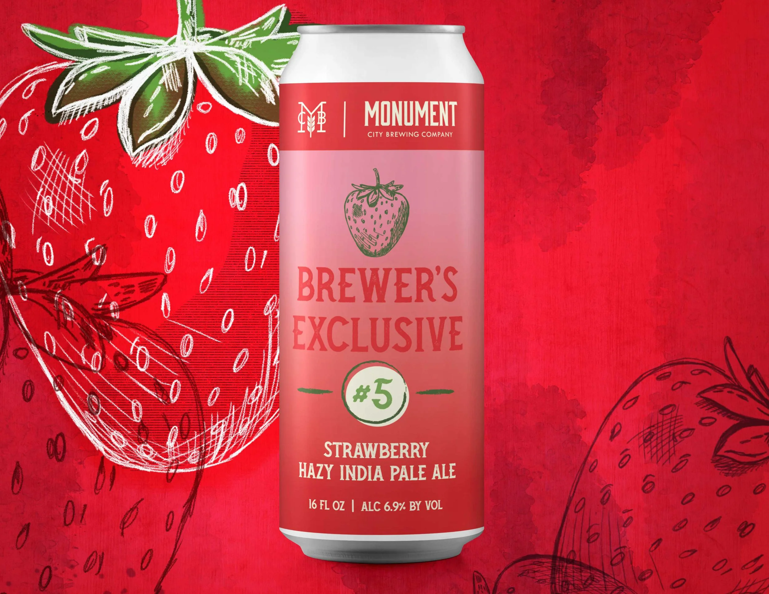
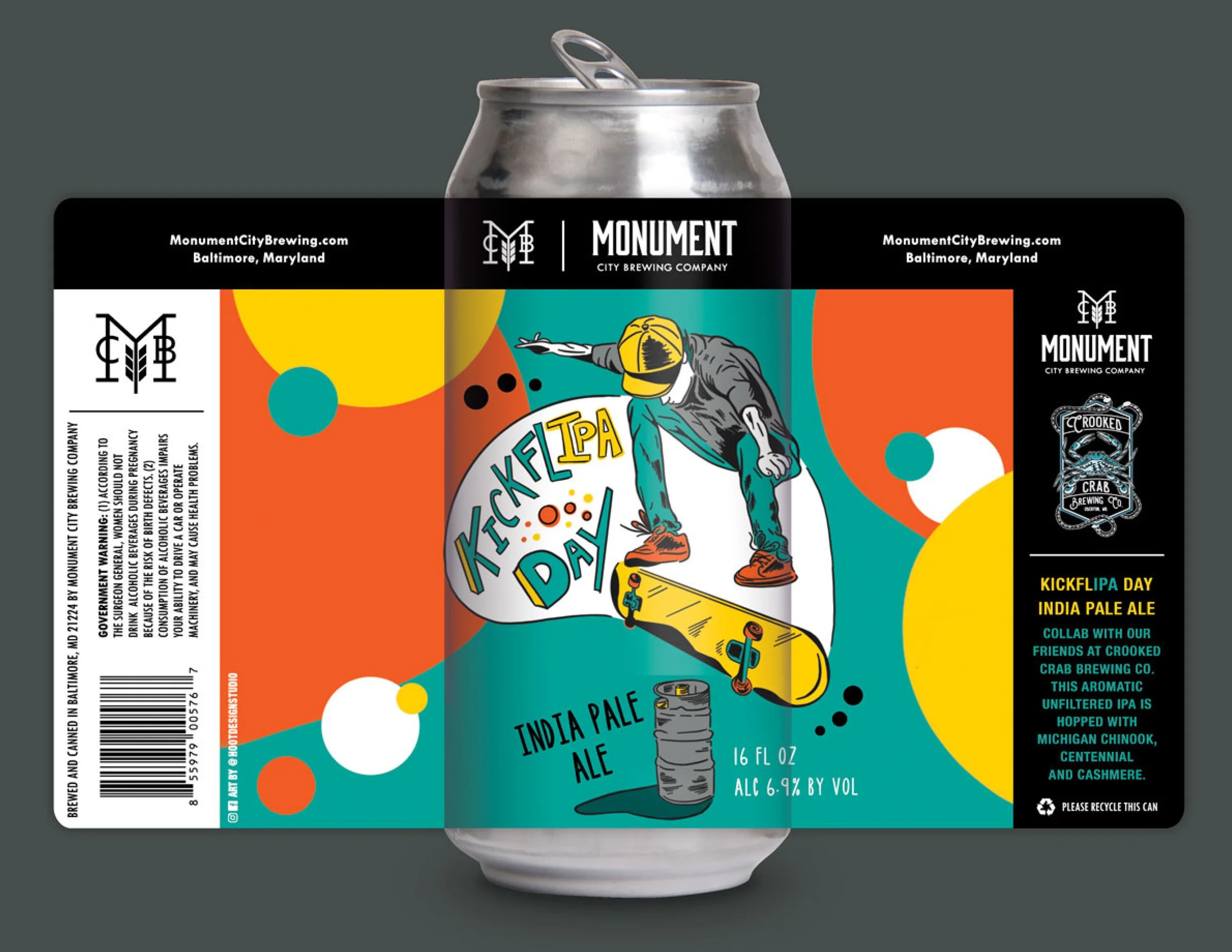
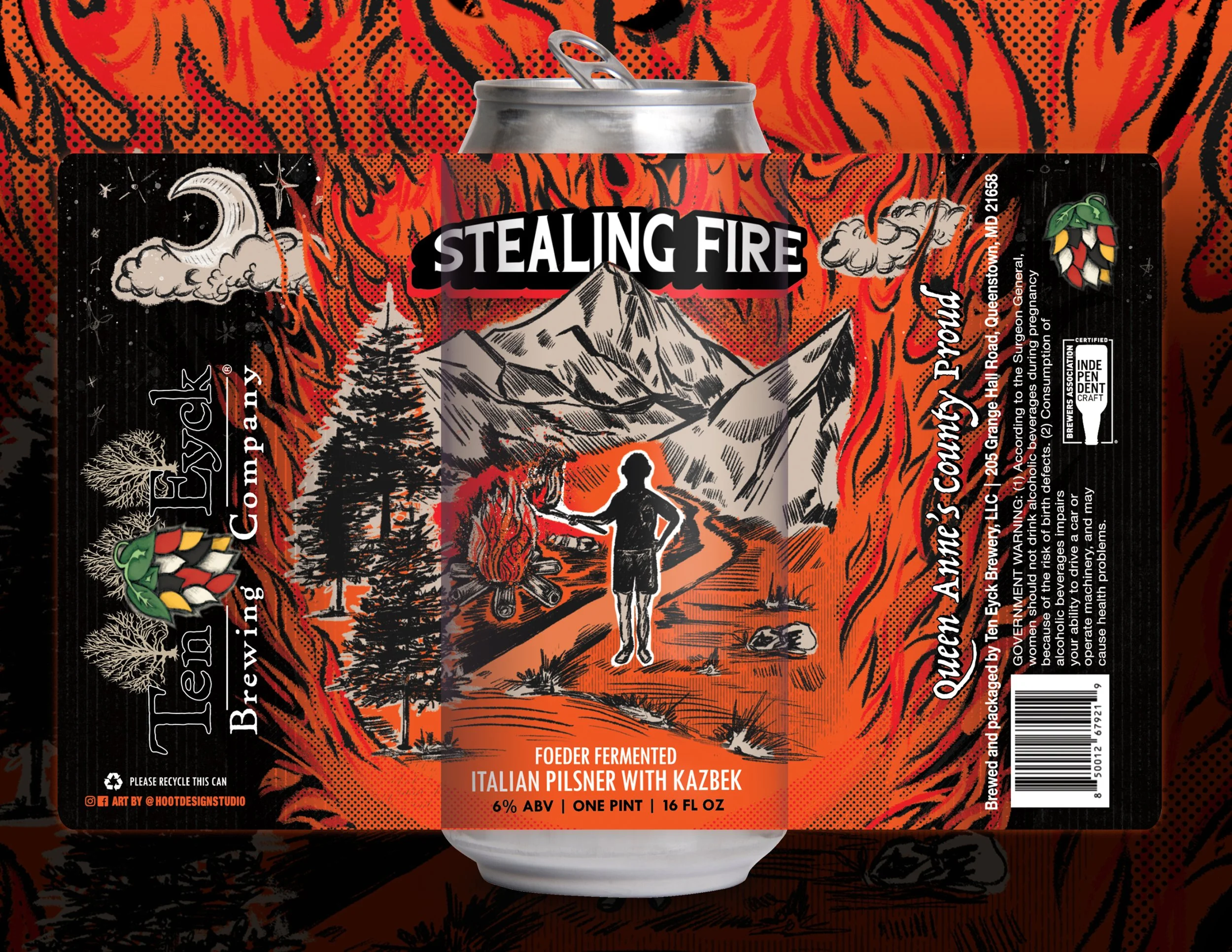
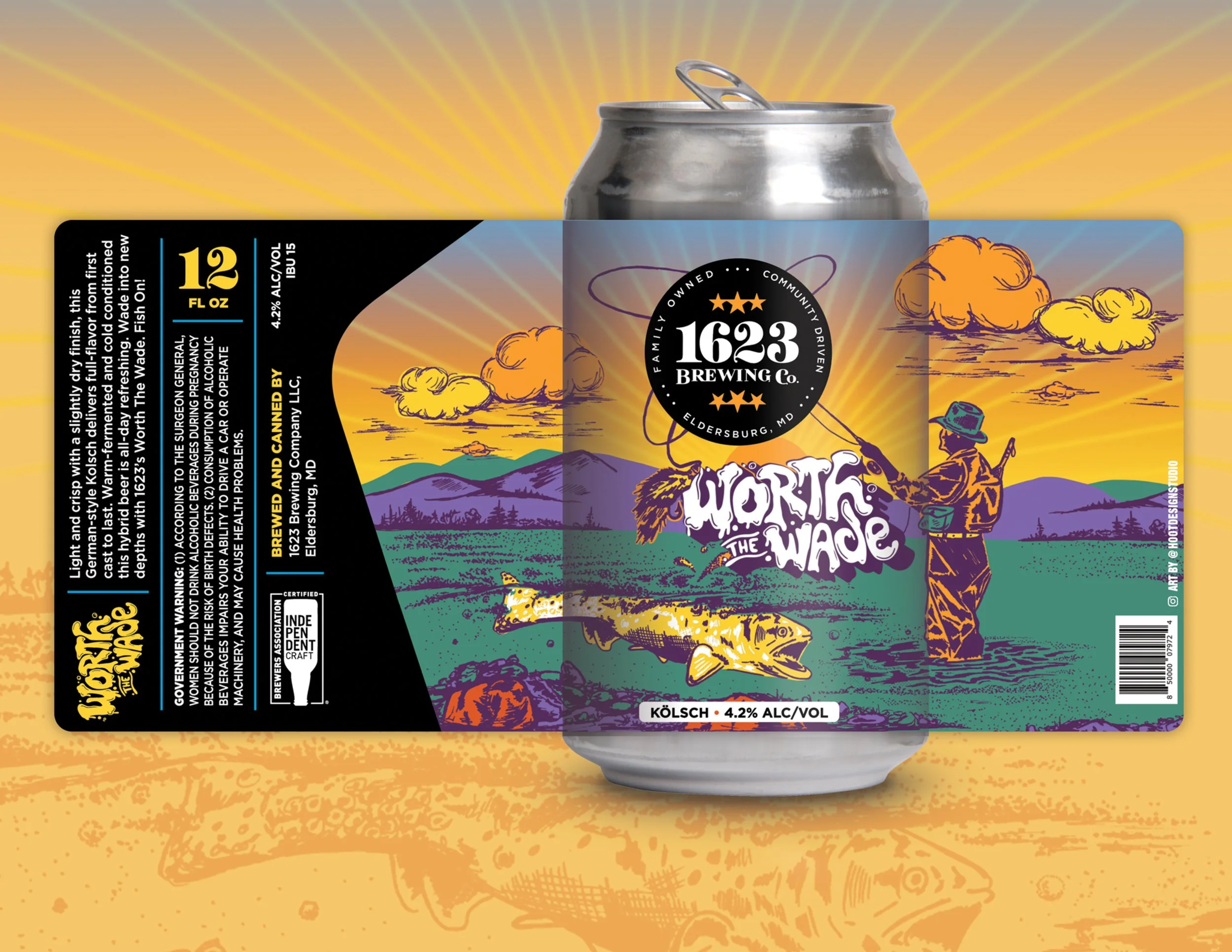
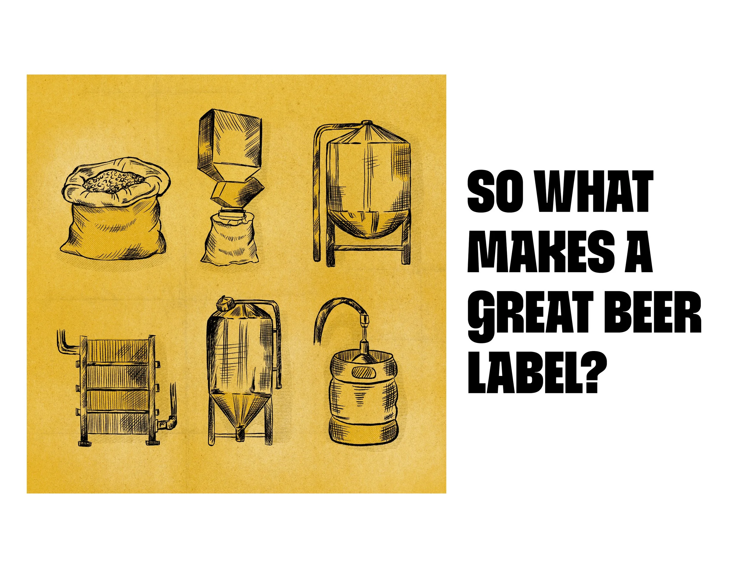
Art is subjective, but what makes a great beer label design? Is it color, layout, illustration or typography?
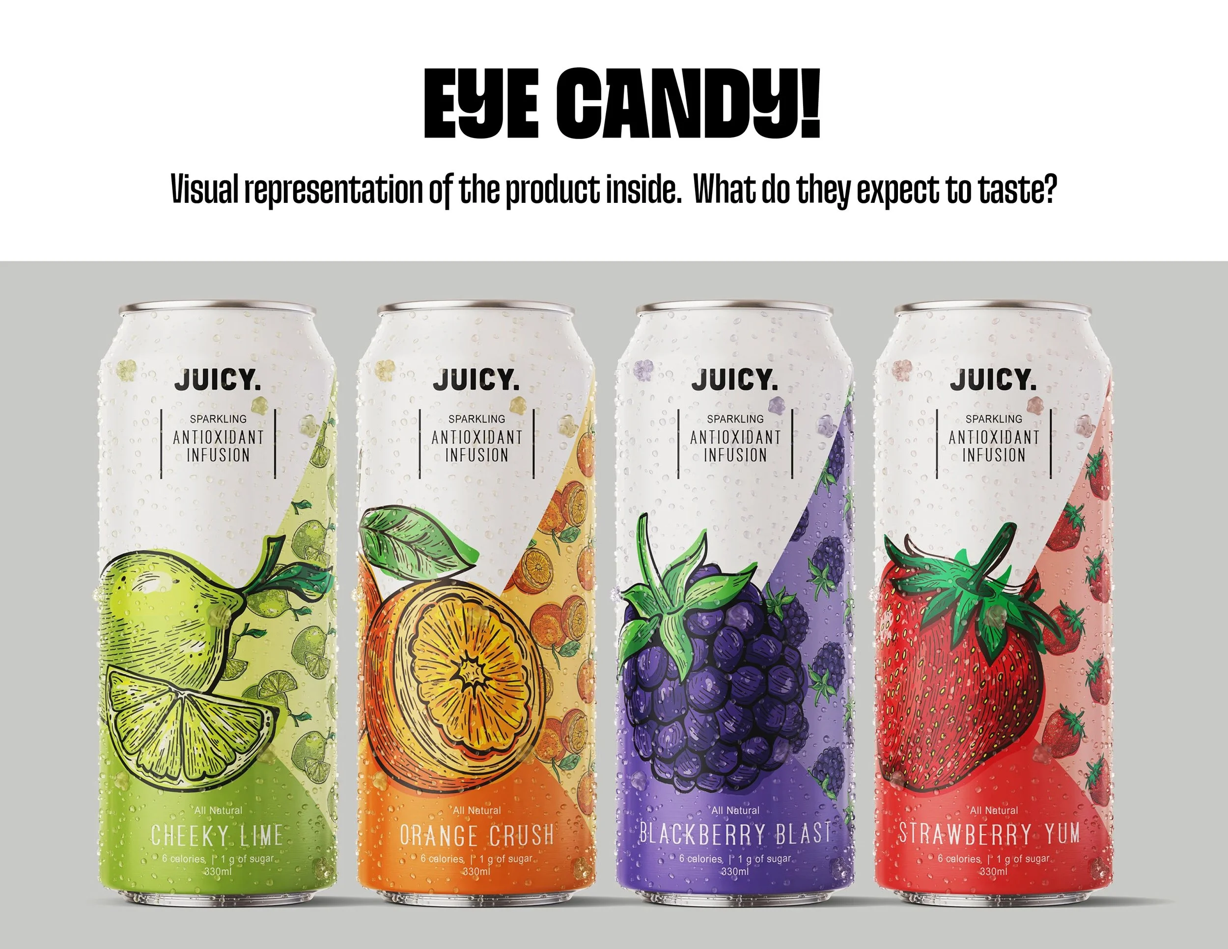
Eye Candy’s vibrant label design uses bold, hand-drawn fruit illustrations to make each flavor instantly recognizable and impossible to miss. Detailed linework, expressive textures, and juicy color create a playful, premium look that visually communicates the fresh, flavorful experience inside the can. This custom illustrated packaging design turns the product itself into the “eye candy,” helping the brand stand out on crowded shelves while creating a cohesive identity across the entire flavor lineup.
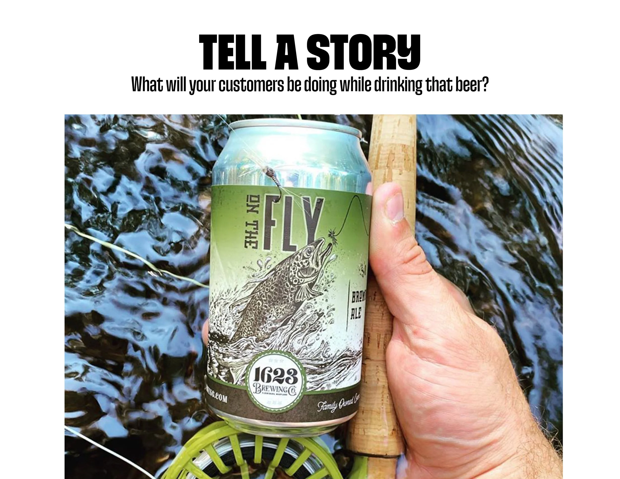
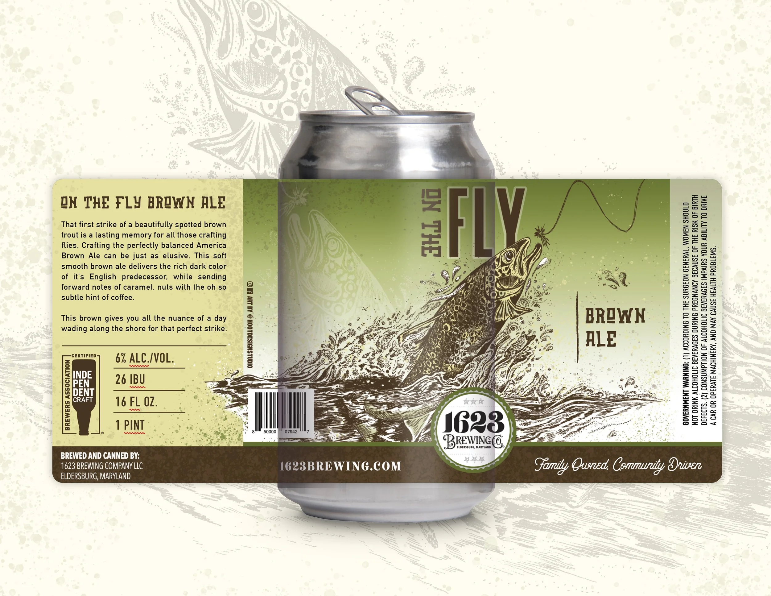
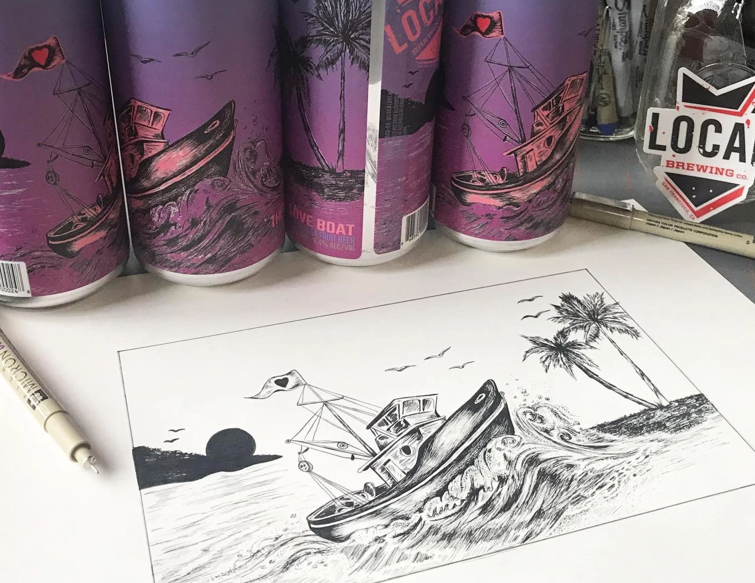
A good beer label should tell a story. It should give you a little glimpse into the world behind the beer—and make you want to know more.
For this label, the story is fly fishing. The fish, the river, the cast, the quiet moments spent waiting for that perfect strike. The illustration brings that experience to life and gives the beer a sense of place, personality, and adventure before you even crack it open.
That’s what I love about illustrated beer labels. They’re not just decoration—they’re storytelling in a bottle (or can). The right illustration can transport you somewhere, spark a memory, or make you want to pull up a chair and hear the story behind the beer.
Great beer. Great story. Great label.
